The 100 new NCS colours are divided into four colour areas which have been named White Delight, Nordic Midtones, Great Greys and Blackish Elegance. All have low chromaticness but the four colour areas have distinct differences to add drama or depth to your designs.
Low chromatic colours are very important in both interior and exterior design, architecture and product design, however, it can be difficult to distinguish between low chromatic colour samples until they are applied. Once the colour is applied slight differences in nuance or hue can make a major impact on the final design appearing too beige or too grey in certain lighting.
For this reason NCS Colour have made the Standard range of colours denser in the low chromatic area of colour space, made possible by new coatings technology. These 100 colours have never before existed in the NCS Standard colour range and thus fill the gaps in the range and extend its usefulness in practical design application.
Read on for suggestions of how to use the four colour areas to enhance your designs – each colour area has one chosen hero colour which have been illustrated here.
White Delight
Who doesn’t love a fresh bright white? It could be a new page in a notebook or a new T-Shirt. White stands for clean, light, and calm but in our homes, white can be cold and sterile.
The new tinted whites are whites with a hint of colour gained by adding a slight chromaticness. They are very popular softer whites, but still, give the feeling of being light and fresh. Within this area, NCS have launched 16 new hues, going from -R to G50Y all prefixed S 1505.
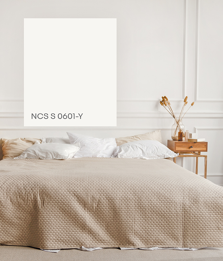
Two brand new nuance positions have been added into the NCS Circle: NCS S 0601 and NCS S 1001. This area will include ten colours, referred to as off-whites. S 0601-Y is known as Prime White
NCS S 0601-Y PRIME WHITE
White makes our spaces light, open and big. The white area is also the area where our colour perception is the most sensitive. We can perceive very small colour differences in this light area. Therefore, we are introducing brand-new Y, R, B and G 0601 and 1001 colours, to give users greater control when choosing these colours. Here, you find Prime White, NCS S 0601-Y, the perfect choice for a warmer white.
Nordic Midtones
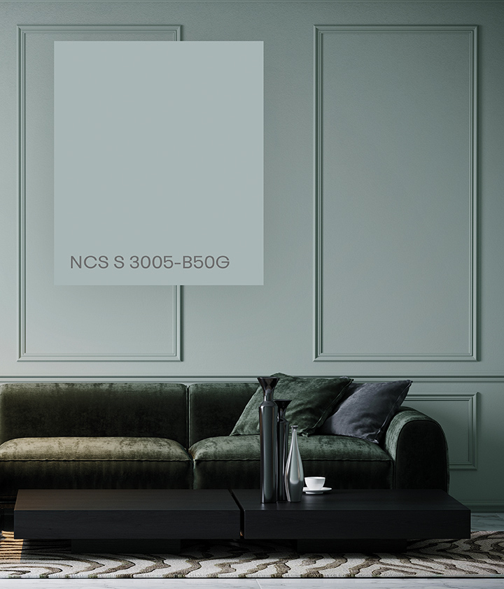 This colour area consists of warm and elegant colours that are a little darker and more colourful. They are strongly linked to Nordic design and the northern hemisphere, where the natural light comes in from an angle that gives the colours a shadowed “dark character”, with high blackness in relation to colour. Nordic design often consists of these colours, related to nature creating a space that is calming, not cold or unwelcoming.
NCS S 3005-B50G NORDIC GREEN
Our new Nordic Green, NCS S 3005-B50G, is the perfect representation of this calm Nordic dusk and dawn colour of the Nordic nature. These mid-tones indulge us in a mood of calm, relaxation and closeness to nature without having colours that are perceived as either chromatic or neutral.
Great Greys
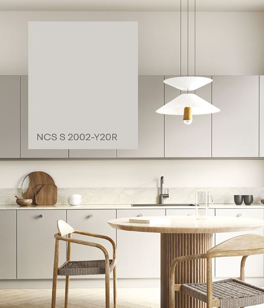
In recent years, light, white colours have been very popular, along with the Scandinavian decoration style. We now see that we are slowly moving a bit towards more colourful areas, albeit toned down. The perfect balance in this colour area is greige. Greige consists of a scale between grey and beige. The search for the perfect greige is constantly spinning in interior design threads and blogs. In NCS notation, it lies between Y20R and Y30R, somewhere between wheat fields, reddish tones, and sand. Here is an area that we have filled in with new Standard colours to be able to offer the perfect greige.
NCS S 2002-Y20R SOFT GREIGE
Greige is a colour that has a hue between Y and R but is very low chromatic, with only 2% of chromaticness. There are light greige, mid-greige and dark-greige variations. After a thorough market analysis, we have decided to launch our own perfect greige; a light greige that we call Soft Greige, with the notation NCS S 2002-Y20R.
Blackish Elegance
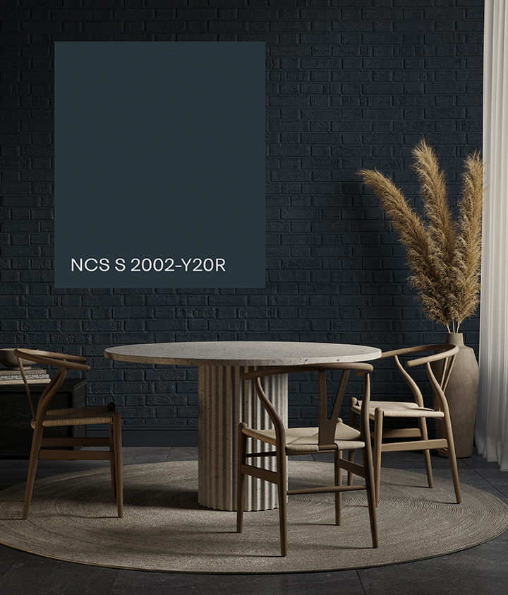
Dining in Blackish Elegance S 8005-B
When black is no longer black, but elegant dark colours with a touch of chromaticness. These colours give a very modern and contemporary feeling. The palette enhances the sense of luxury and mysticism. The colours are perfect to emphasise lighter and more chromatic details.
NCS S 8005-B MIDNIGHT BLUE
This new range of Blackish shades of different hues invites you to make your design very exclusive. The key colour of this range, Midnight Blue, NCS S 8005-B, is the perfect start.
The 100 new NCS colours are now available to purchase as A4 or A6 individual samples.
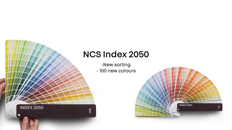
Updated NCS Design Tools
NCS have also released an update of their most popular design tools to improve usability of the tools and sustainability.
NCS Index, NCS Atlas, NCS Block, NCS Album and NCS Box have all been redesigned to include the new 100 colours and consequently to make them even easier to navigate. The different formats work in different situations. Find the perfect colour for your project with Atlas or Block, use Box to see larger samples or carry the Index on site.
Plastic elements have been reduced to a minimum for the new product versions.
The new NCS Index 2050 has highly optimised colour sorting based both on user preferences and the NCS Colour Circle. This makes it quick and easy to find the colour you have in mind. Within each hue-section the colours are arranged by nuance following the NCS Colour Triangle. On each page the lighter colours are at the top and the darker at the bottom. The low chromatic colours can be found in a separate section and are sorted by nuance which is the preferred method of choosing these types of colours.
2050 NCS colours to delight your designs