Colour plays a vital role in how we style and decorate our homes. Through accurate colour measurement and management of homeware and furniture, you can be sure your interior product designs are in line with your vision!
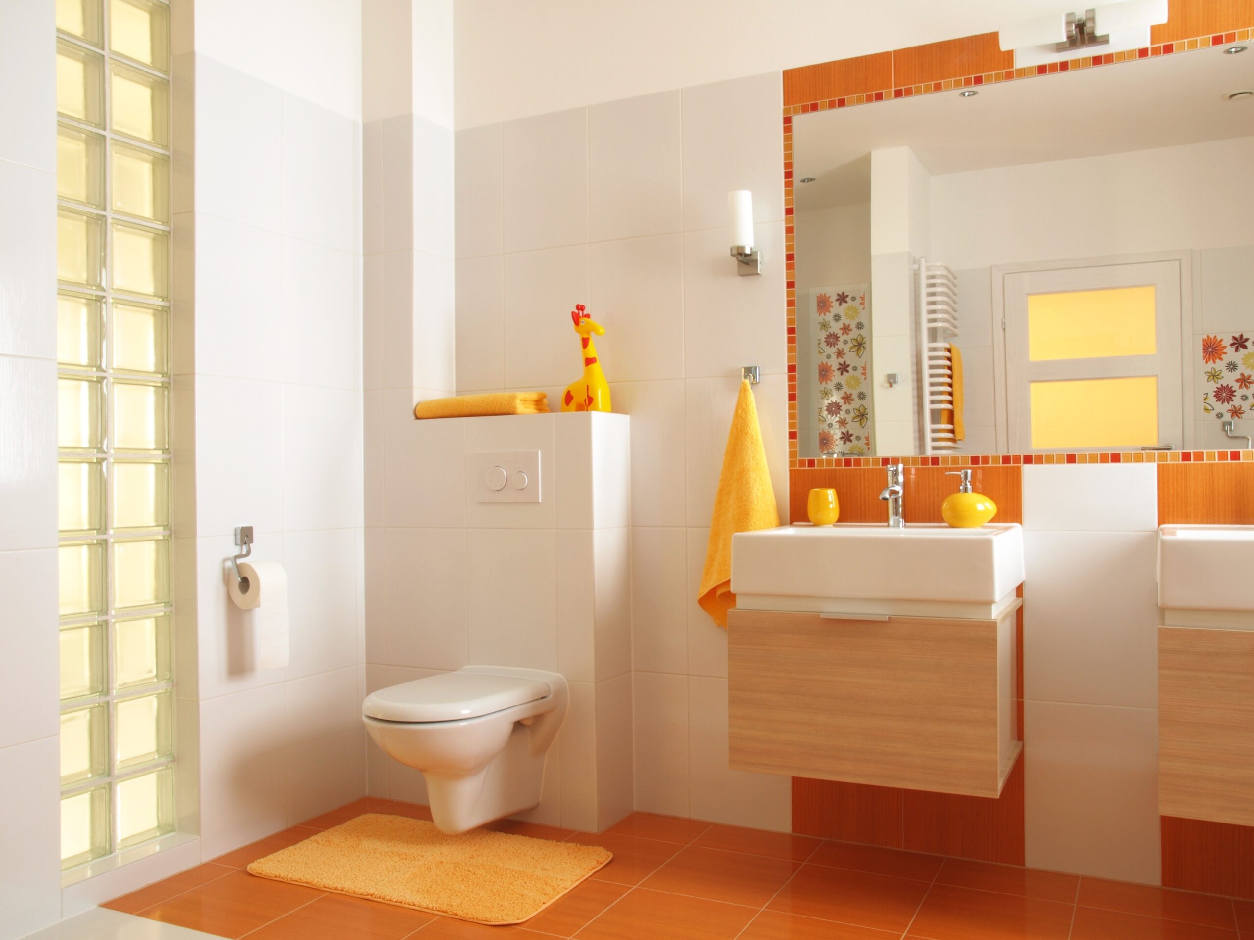
Multiple materials are used in homeware and furniture designs, including both flat and textured surfaces, pile fabrics, plastics, glass, wood, veneers and even powder-coated metal.
This variety can be challenging for traditional methods of colour measurement for homeware and textiles, such as spectrophotometers, which struggle to account for factors that influence a product’s appearance. For example, the pile direction on a towel, or the shadowing caused by tufts on a carpet, might be difficult to accurately measure.
Not only can this cause accuracy and repeatability issues throughout the supply chain of an individual product, but it also affects how well a product harmonises with other homeware items in a coordinated interiors range.
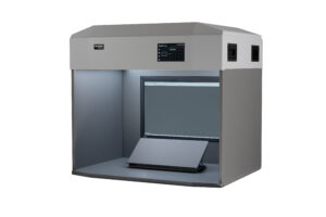
Our DigiEye digital system provides fast and accurate colour measurement data for homeware and fabrics, guaranteeing colour consistency.
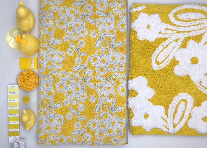
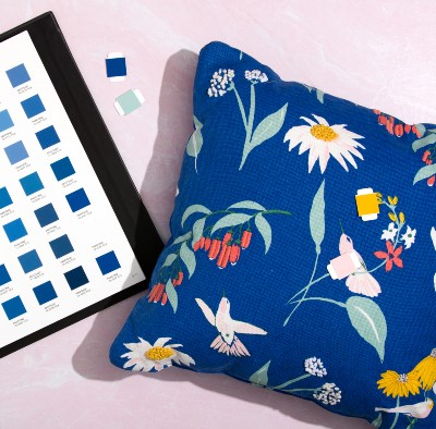
Because it can assess the same colour across a variety of textures, blends and materials, you can guarantee colour matches of coordinating items, such as bath towels and soap dishes, or cushions and curtains.
When it comes to pile and open construction fabrics, tufts can be measured and assessed within DigiEye as they are actually seen by end consumers. You can also apply certain filters to identify and exclude shadows or any design details, like stripes or patterns.
VisionView gives you the best of both digital and visual assessment. Our all-LED light booth allows designers and suppliers to check the appearance of a product under different point-of-sale lighting, while comparing it to the approved standard on screen.
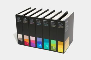
Interior and product designers need to know how to communicate colour to their clients and suppliers. Pantone supplies colour standards in both textile and plastic materials, RAL in paper and plastic and NCS in paper.
Textile designers and manufacturers use Pantone Fashion, Home + Interior colours for carpets, towels, curtains and bedding products. These colours are also used for hard homeware goods such as ceramics, resins and plastics for kitchenware, vases and decorative items.
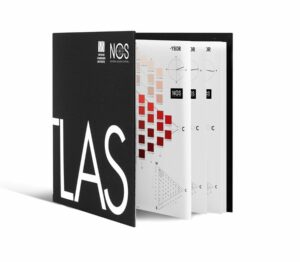
NCS colours are often used to specify and colour match kitchen doors and bathroom fittings as well as for painted furniture, decorative products and flooring.
RAL Classic colours are also used by kitchen design and furniture companies as are RAL Design colours. For inspiration the RAL website has several examples.
You can also check out RAL’s reference books which have plenty of information on colour psychology and colour trends for interior designers and architects.

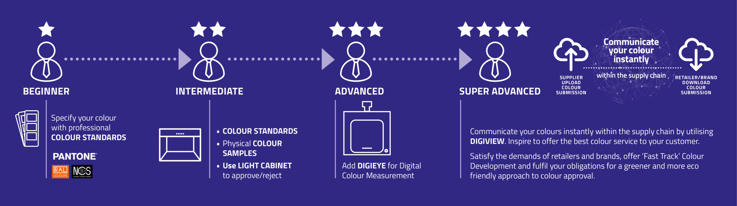
If you are at the start of your colour matching journey, we advise starting by choosing the correct colour standards. As master distributors of Pantone, RAL and NCS, we have the expertise and knowledge to guide your decision making. Contact us via email on colourstandards@verivide.com or call us on +44 (0)116 284 7790
If you have the correct colour standards but wish to know more about how our lighting cabinets and DigiEye software can benefit your colour matching process and how these elements can fit into your industry and product designs, please email us at enquiries@verivide.com or call +44 (0)116 284 7790.