Colour accuracy is a huge concern for many manufacturers. Colours will look different on a screen, a printed sketch, on material, in different lighting. Globally available industry colour standards are key to accurate and precise colour specification across the supply chain.
Replicating colours from an idea can be difficult.
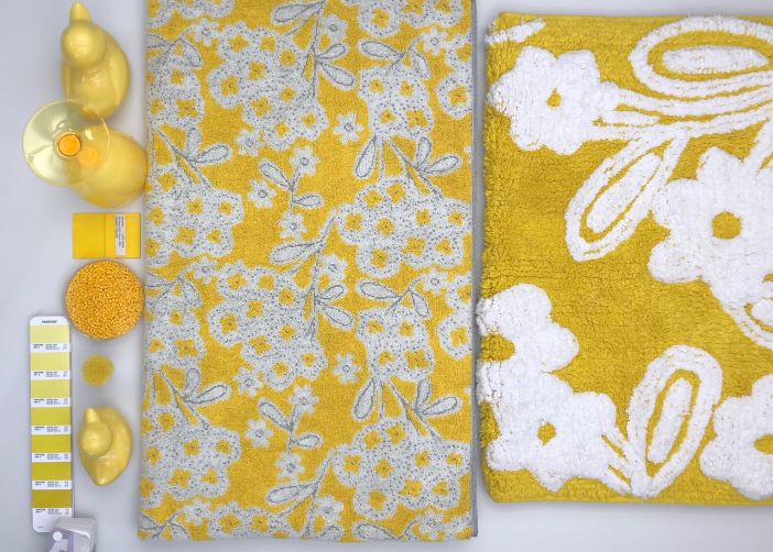
By using a photo or a piece of material as a template it makes the colour very tough for a supplier to translate. For starters, if using a piece of material, what substrate is it? How was the fabric manufactured? Has it been washed or damaged? Is this the original colour or has it faded?
There are many elements that will affect your colour scheme and by not having the desired colour, it can modify the whole design and final image of your product.
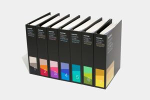
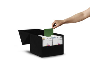
One solution to accurate colour replication is to use an industry colour standard such as Pantone, RAL and NCS who all produce engineered colour standards which are globally available. You can be certain that if you choose a colour from their ranges, your suppliers can obtain the colour standard wherever they are.
Engineered colour standards are a close match – usually DE 0.5 or below to the original master measured data for the colour, additional spectral data can also be obtained.
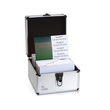
Examples of engineered standards in the various ranges are:
Pantone paper products are not engineered colour standards and they can vary from print run to print run.
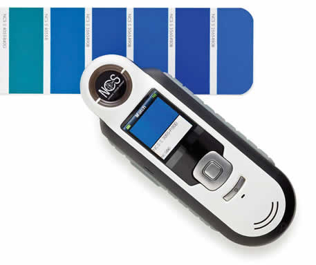
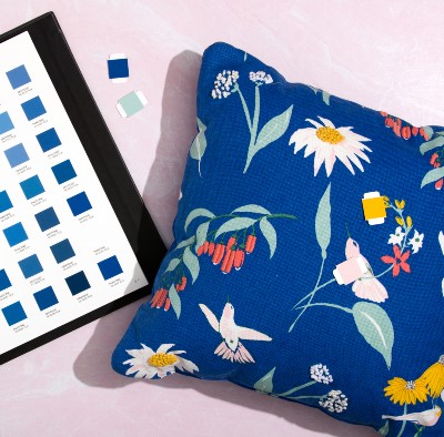
Pantone, RAL and NCS all make handy digital tools to quickly identify the closest standard to your colour inspiration. Pantone’s ColorMatch Card enables you to accurately measure colour samples using your smartphone and find the closest Pantone colour from all their ranges. The RAL Color Reader colorimeter collects colours from real life samples and transmits results to the RAL Color Reader App. The NCS Colourpin ll and Colourpin Pro colorimeters give the closest NCS notation and again connect to your smartphone enabling quick communication of colour. If you have patterned material the NCS ColourScan or Pantone Capsure can identify up to 4 colours in one capture.
By choosing an industry standardised colour, you can be assured that the whole supply chain, from designers to manufacturers and product development teams, are matching the exact shade of colour requested.
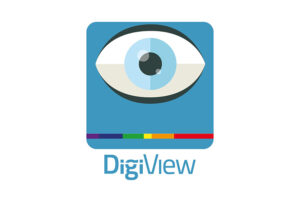
By using our DigiView software, you can view the manufacturers submissions to tell whether a colour is achievable on a particular substrate (if it has a database of dyes linked) as well as if it will have the desired effect that you are expecting.
Saving on costs, time and effort in the supply chain, and enabling designers to release their creativity knowing the end product will be as they anticipated.
Having colour standards is great, but they need to be fit for purpose and by that, we mean that they need to be relevant to the type of material you produce. It is almost impossible to match a textile fabric to shiny paper for example. The right colour standard for you depends upon the industry you are in and the type of product you produce.
We have provided some industry examples below to help you on your way!
| Colour Standards | Pantone | RAL | NCS |
|---|---|---|---|
| Interior Design | ✓ | ✓ | ✓ |
| Industrial Design | ✓ | ||
| Graphic Design | ✓ | ✓ | |
| Printing & Packaging | ✓ | ✓ | |
| Exterior Design | ✓ | ✓ | |
| Fashion & Accessories | ✓ |
For more information on our DigiView software, contact us today and one of our DigiEye experts will be happy to help. Email us at enquiries@verivide.com or call +44 (0)116 284 7790.
Still not sure? This is where our colour standards expert is here to help guide you towards the right solutions and products for your needs. Please contact Georgina via email colourstandards@verivide.com or phone +44 (0)116 284 7790.