Inspiration; the process of being mentally stimulated to do something creative. It can be from everyday items or something we spot on our way to work. Whether you use Pinterest to save all your creative inspiration or glue cut outs to a mood board, we all collect our thoughts for new themes, collections and designs.
The problem is how to translate inspirations into your design, and then how to specify the colours to your suppliers.
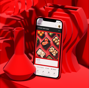
Recently, a start-up business came to VeriVide for advice. The designer knew the type of colours they wanted but had no idea how to translate these into their desired product.
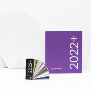
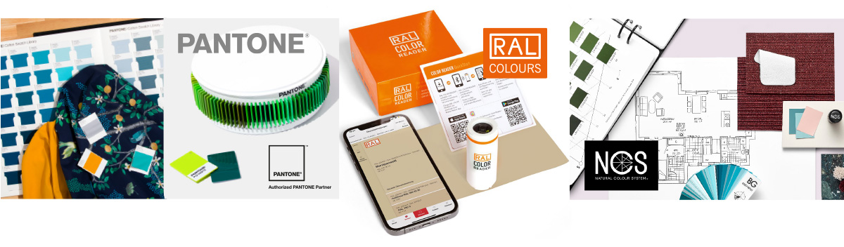
Instead of collect random samples or trying to describe the colour you imagine, we recommend consulting annual trend books and online inspiration from reputable trend companies, because they provide colour references to globally available colour systems alongside the colour inspiration. In addition, Pantone, RAL and NCS all publish trend information suitable for a variety of industries which may be purchased from VeriVide and other sources.
In the example, the supplier overseas asked for colour references to match, they knew they needed a proper colour standard. Having not had any colour training (more on this in our training section), the designer was using an iPhone to Google colours. However, without having the correct screen calibration, the colour on screen did not represent the true colour. They had no idea that each phone screen and monitor is different or how to find a universal colour standard. This made it difficult to specify the colours they wanted. Read the solution below for the advice we provided.
Always calibrate your phone, monitor screen or printer; we offer Pantone tools for doing this important job. Or a self calibrating monitor such as those manufactured by Eizo can be used to show accurate colour. For those designers and buyers wanting to see alternative colours on existing products, use DigiPix software to recolour the image sent from your supplier.
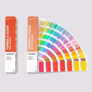
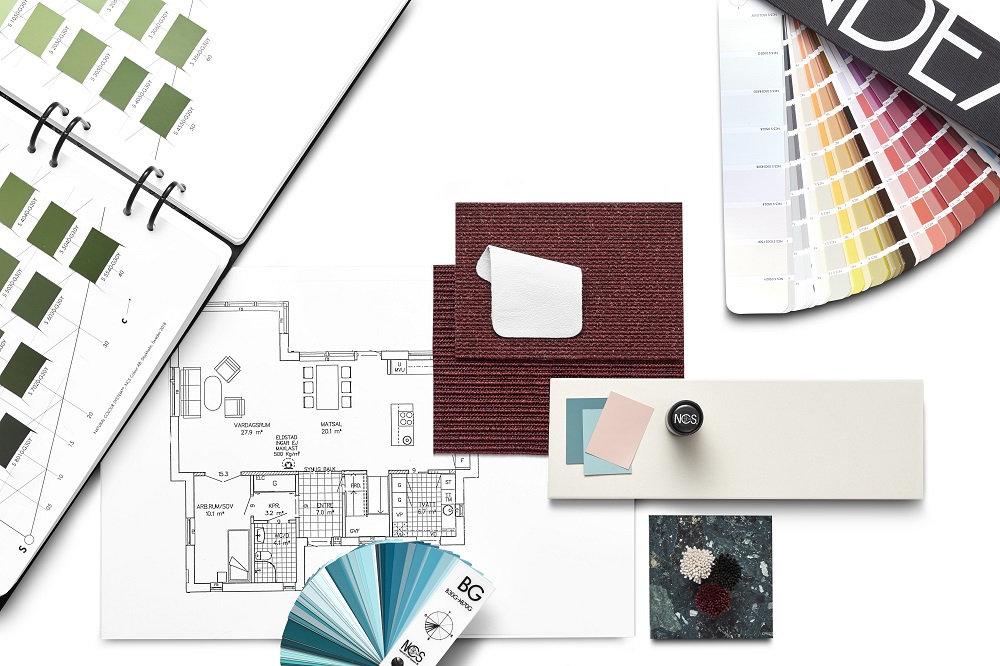
The main solution to your colour creativity, is to invest in a colour standards book relevant to your industry. Many of these have over 1500 colours to choose from and by selecting the right book for your industry, you can be sure the colours will be achievable on your material. The added advantage is your suppliers can also buy a copy so you will both be looking at the same colour.
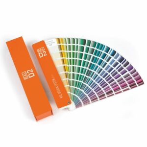
RAL Classic books are most often used in Industrial Design, by Paint Manufacturers and Powder Coated Metal producers. If you are specifying the colour of window frames, metal signage and transport, RAL Classic may be suitable for you. In contrast, RAL Design books and NCS books are most often used by Architects and Interior designers for decorative design. NCS standards are also often used in the kitchen industry for colour matching cupboard doors and accessories. RAL and Pantone both have ranges of Plastic chips which are ideal for Product design of hard materials.
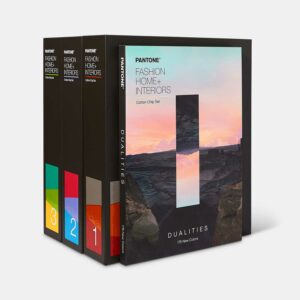
In the example above we recommended a Pantone Fashion, Home + Interiors book as it was apparel that was being designed. Pantone have numerous books suitable for apparel, footwear, accessories and homeware design, including colours dyed on fabric. They also produce a range of Pantone PMS books suitable for Graphic Designers, print and packaging.
Not finding your desired colour? Fear not! Pantone are at the forefront of trends and fashions and regularly add colours to their ranges. They are happy to listen to your feedback for future colour additions, contact pantone@verivide.com to send your request.
With many different colour standards to choose from, finding the best guides for your needs can be tricky. This is where our colour standards expert is here to help guide you towards the right solutions and products for your needs. Please contact Georgina via email colourstandards@verivide.com or phone +44 (0)116 284 7790.
You can also head over to our blog page to find out the latest colour trends and inspirations.