


It is a question we are often asked by our customers: Why are light boxes and cabinets grey? Well, we’re going to answer that for you.
In short, grey is not a colour that was decided upon by chance, but because it is uniquely suited to visual assessment.
Here, we’ll reveal further exactly why grey is the colour of choice, rather than the multitude of other colours that are readily available.
You can have any colour as long as its grey – VeriVide (via Henry Ford).
Functional finishes
From the beginning of standardised visual assessment, light cabinets have been a neutral grey colour.
However, as advancements have been made in paint and finishing techniques, so too have the interiors of VeriVide Colour Assessment Cabinets (CAC & CAC LED).
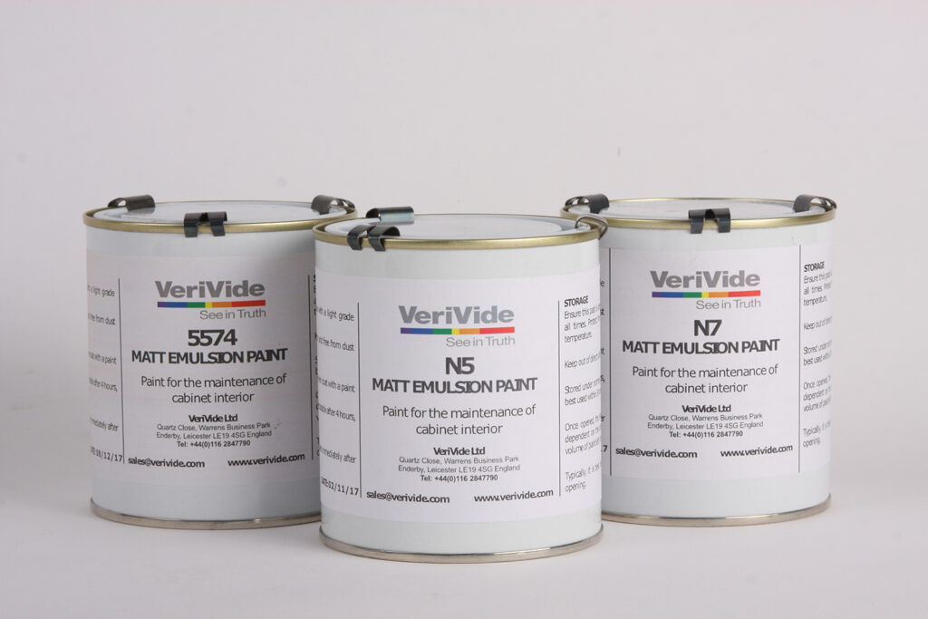
VeriVide currently offers three interior colour finishes, Munsell N5, Munsell N7 and VeriVide 5574.
The new UltraView light booth can only be specified in Munsell N5 and Munsell N7.
But why is the colour grey?
To understand why light cabinets are grey, it is important to understand a little bit of the science surrounding colour.
The first attempt at scientific description of colour was undertaken by Albert Munsell, who sought to create a ‘rational way to describe color’. His findings have been developed over the past century into the Munsell Color System that is still heavily relied on today.
This system is used to describe colour attributes, in terms of lightness, chroma and hue (L C H values) to communicate colour accurately to suppliers’ designers and many others.
VeriVide offer colour training courses to help you better understand and communicate colour throughout your supply chain.
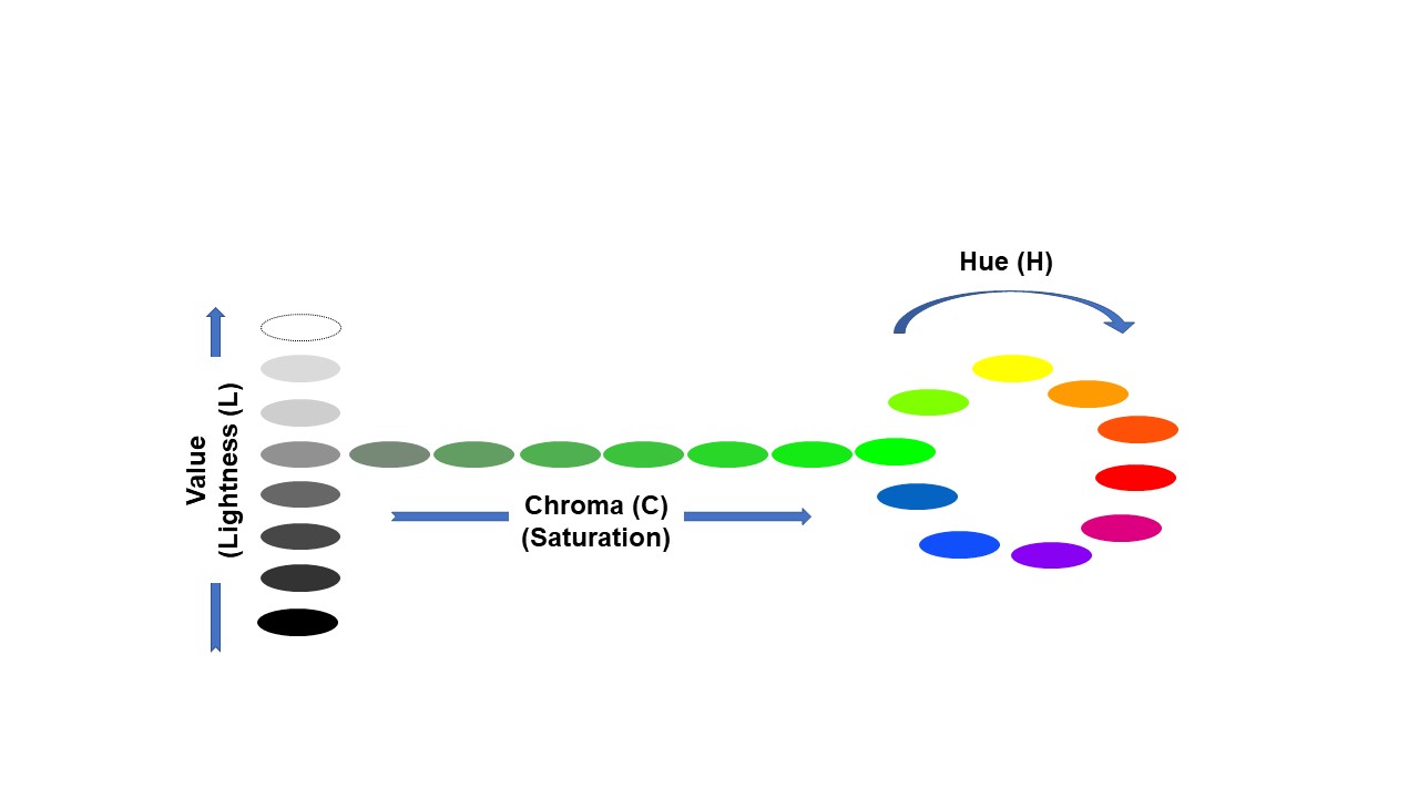
Image: Lightness Chroma and Hue graphic.
Colour research has revealed that in order to best assess the full spectrum of visible colour, the surrounding area would ideally be completely matt, in the absolute middle of the lightness scale and have a neutral saturation. According to the Munsell Color Space model, this colour is grey.
Simultaneous contrast
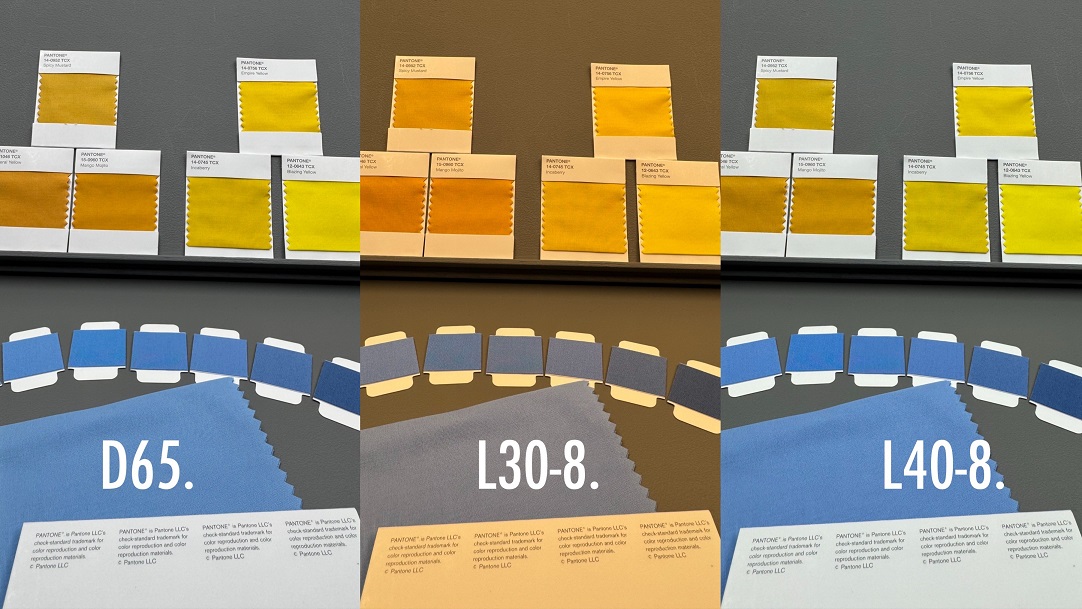
Part of the reason why neutral grey is chosen is because of a phenomenon known as simultaneous contrast. Simultaneous contrast occurs when two adjacent colours influence how we see them. One colour could become more or less saturated and even the hue can appear different. In the image below the two green squares are identical but they appear to be different because of the different coloured backgrounds. 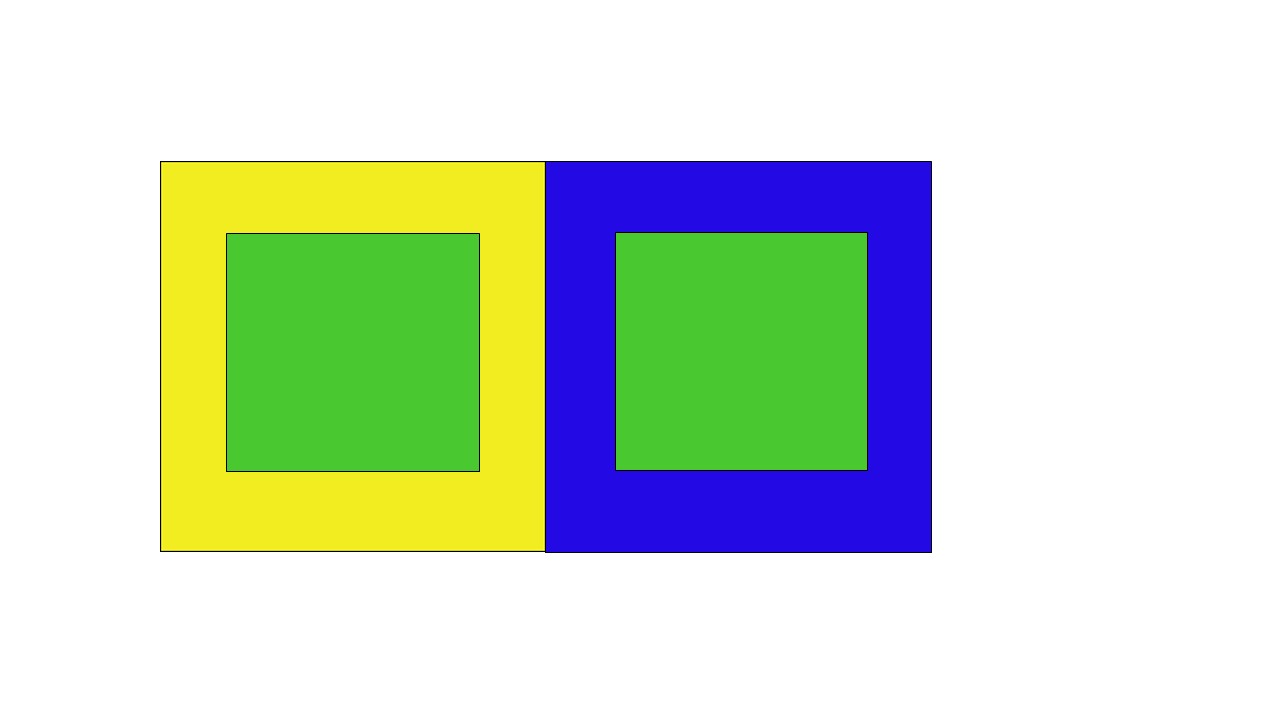
This interference with colour perception is disastrous for standardised visual assessment. For example, if you are trying to match something to a standard using a cabinet with a red interior, this interior will influence the assessor’s perception of the sample and the standard, causing them to make the wrong decision.
For suppliers, this can result in fines and loss of contracts, and for retailers and brands, sales can suffer. See this phenomenon for yourself in the image below, the colour blocks along each row are identical but appear very different when on a graduated background (on the left) compared with a solid background.
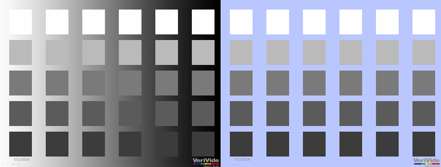
Image: Identical colours appearing different when seen on a different background
However, solid neutral colours and particularly grey, do not alter our perception of colour. This makes neutral grey the ideal colour for a light booth.
The Munsell color space assigns values to determine how light or dark a colour is. For neutrals, black is 0 and white is 10, denoted N0 and N10 respectively. VeriVide offer two Munsell neutral grey colours of varying lightness, N5 and N7. VeriVide equipment is manufactured with Munsell N5 as standard, which is in the middle of the Color Space. We also offer the lighter Munsell N7 used to comply with some specifications or standards.
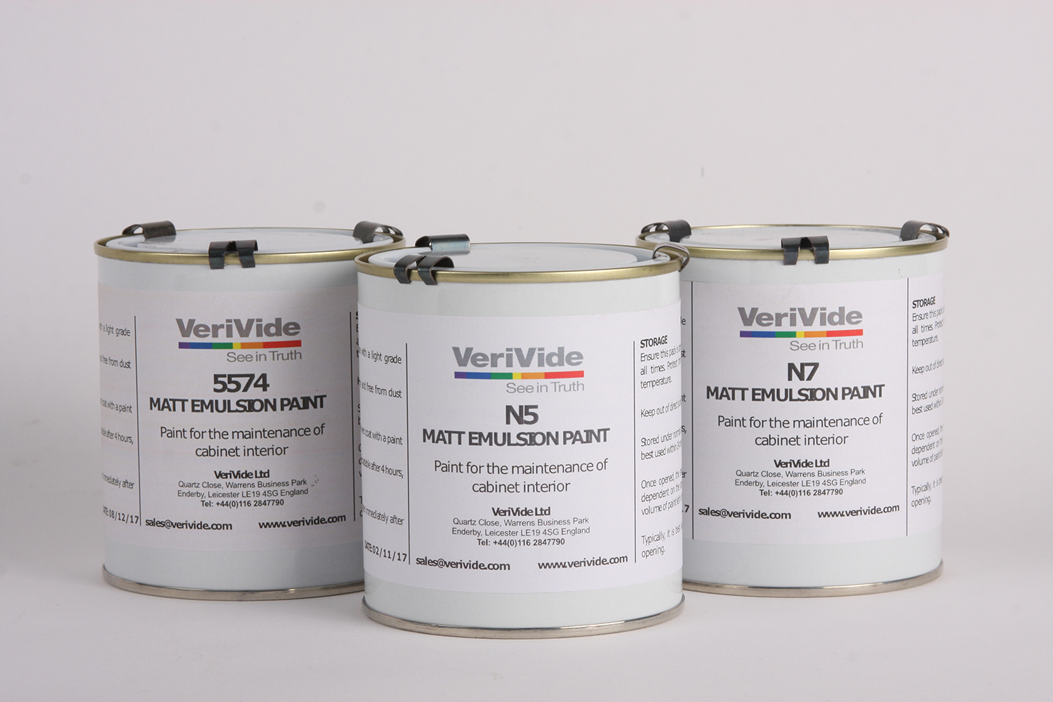
Image: VeriVide 5574, N5 and N7 paint
5574 Grey Paint
Since 1964, VeriVide and Marks & Spencer have worked together in creating and updating VeriVide 5574 for M&S standardised assessment conditions in light boxes throughout their product supply chain. The colour is a neutral grey, similar to N5 but slightly darker and greener. Several other retailers and brands approve 5574, however as of 2023 M&S have reverted to specification of Munsell N5 as the interior colour for light booths in their supply chain. For more information contact your local M&S sourcing office.
Which colour should I choose?
The colour of your cabinet will be determined by a number of factors, such as the industry you serve, who are your clients and the end usage.
It is important that assessment conditions are standardised throughout your supply chain to ensure accuracy and repeatability in results. That means ensuring all light boxes have the same interior colour and the same light sources are used.
Brands or retailers will usually specify a colour that must be used for visual assessment in a lightbox. Typically, N5 is used by most end-users, with N7 associated more closely with American brands and retailers.
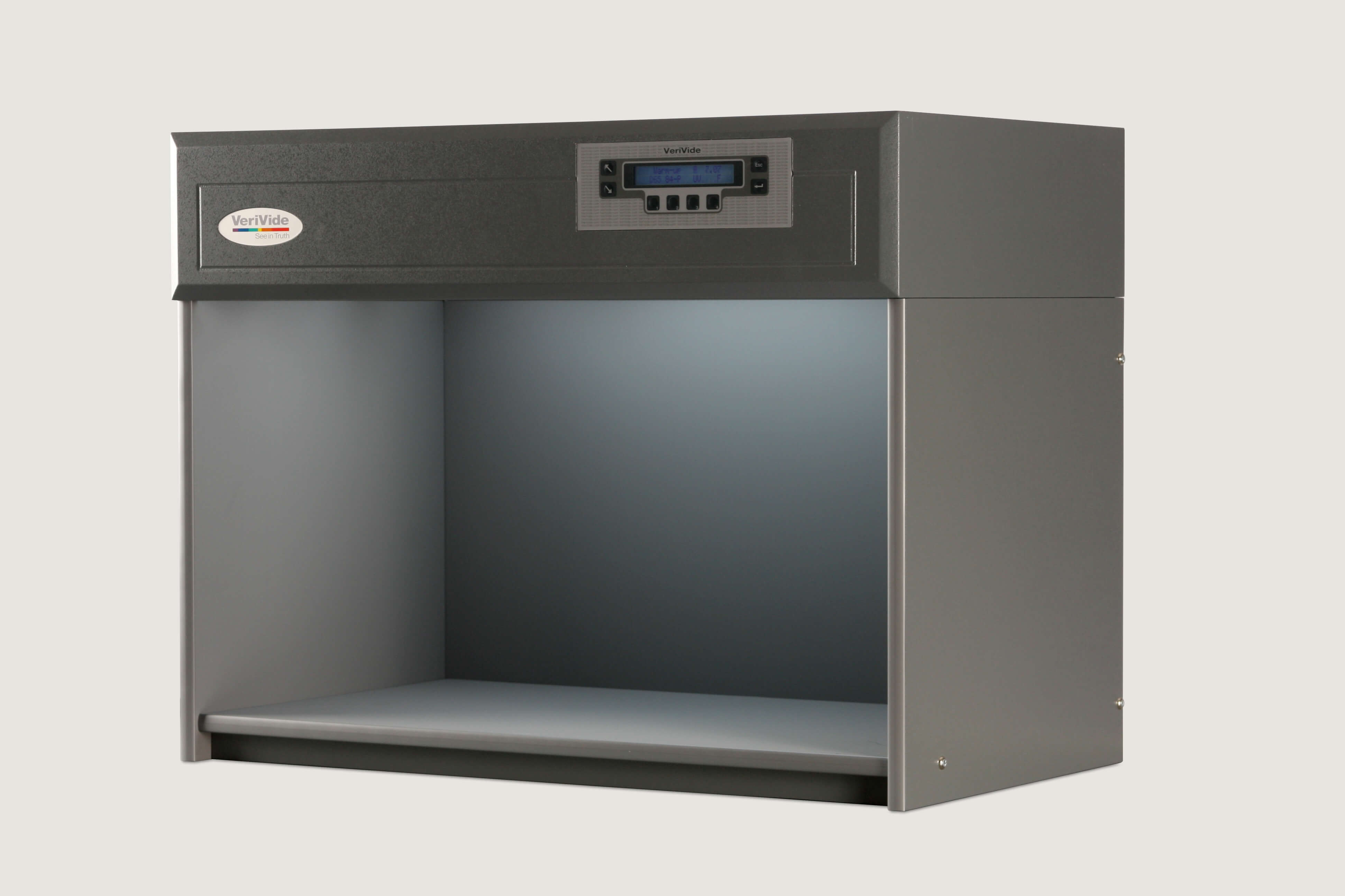
Image: Verivide CAC60 in N5 finish
Light boxes in N5 and N7 finishes both adhere to ISO 3668 standards. If you are unsure which colour is right for you, please get in touch.
Hopefully, this article has helped you understand why VeriVide Colour Assessment Cabinets are grey. We also provide tips on how to use your cabinet effectively and on best practice visual assessment.
If you want to learn more about the VeriVide range of light booths, download visit the product page or contact us at: sales@verivide.com or on 0116 284 7790.