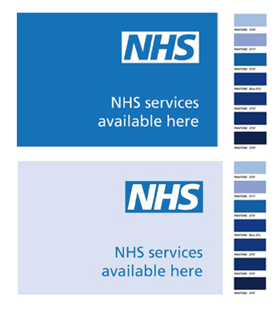


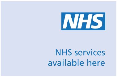
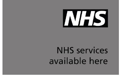
The NHS Corporate branding colour is NHS Blue which is Pantone 300. Use this as the primary colour when designing communications materials. The logo should be NHS Blue or Black if against a light background and reversed out so that there is a white border around the lettering when printing on a dark background.
If the colour is required in another format such as paint then take a sample of the Pantone colour to your paint manufacturer to mix paint to match. Alternatively the closest matches to NHS Blue for powder coating are BSI 18E53 or RAL 5017.
Additional colours
According to the NHS Brand Guidelines* this is supported by a vibrant secondary colour palette of 13 colours to be used for printed materials. The range of colours allow for creativity and diversity while remaining true to the NHS branding.
The secondary colours are also Pantone colours and are:
Dark Green 342, Green 355, Lt Green 368, Aqua Green 3272, Aqua Blue 312, Light Blue =Process Blue, Dark Blue 287, Purple 2685, Dark Pink 676, Dark Red 1955, Red 485, Orange 144, Yellow = Process Yellow
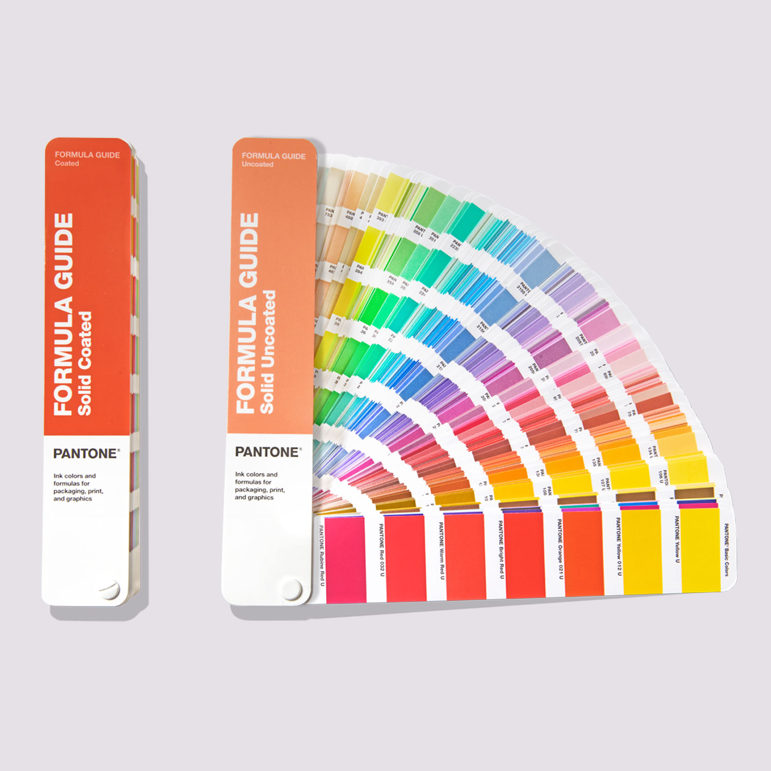 Note that these guidelines do not refer to a suffix of C or U which denotes that the colour is on Coated or Uncoated paper. This is important as the colours do appear different when printed on different media types. The NHS branding colours can be found in the Pantone Formula Guide Set, this contains both a Coated Guide and an Uncoated Guide. Invest in the Formula Guide Set to access the branding colours of many UK and global companies.
To match the Pantone colours accurately Pantone Spot inks are required, the Formula Guide lists the actual ink recipe for each colour. However, the NHS colour palette has been chosen with 4-color process printing in mind for economical production. The colours selected will replicate the Pantone® spot colours when printed in Digital four-color process (also known as CMYK printing). This is not the situation with many Pantone colours which are much less vivid and even quite dirty when printed with CMYK (Cyan, Magenta, Yellow and Black) inks.
If you don’t print spot, 7 is your best shot!
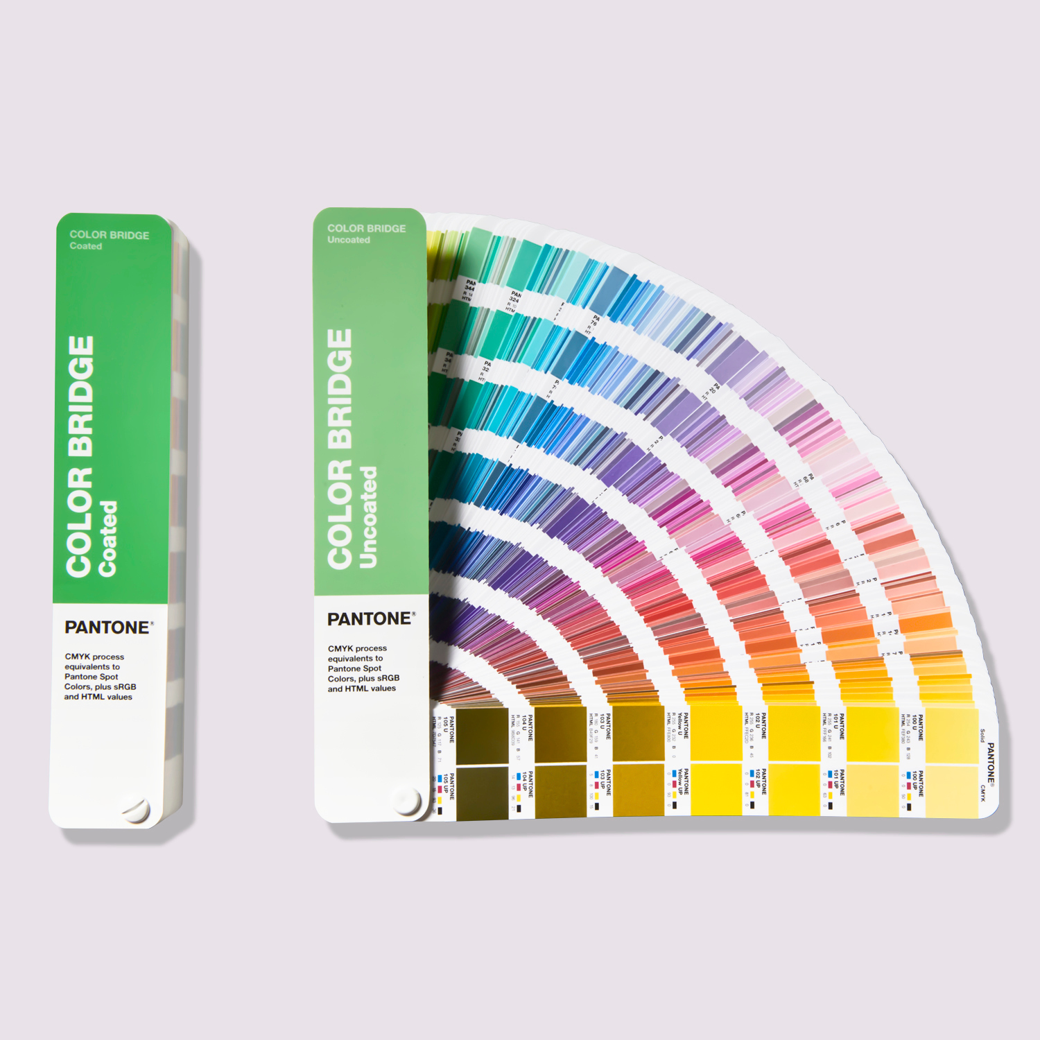 Using Pantone spot colours to match brand standards is always the best and most reliable option. However, if budget or process challenges arise, the next best option is to use the Pantone Color Bridge to assess any colour difference.
The colour match can be checked using a Color Bridge Guide Set. This shows the Pantone Spot colour with its RGB values on one side and the CMYK equivalent with the CMYK values alongside it.
If you have access to more sophisticated Digital printing equipment this may now have additional inks. Printers with seven inks have Orange, Green and Violet as well as Cyan, Magenta, Yellow and Black. This extends the colour gamut which allows you to match almost 90% of all Pantone Spot colours without investing in Pantone Spot inks.
If you found this blog useful why not try Why We Love White (And You Should, Too!)
Feel free to contact us by email to pantone@verivide.com or phone to +44 (0) 116 284 7790. We are happy to help you with any colour challenges or answer your questions.
* NHS Brand Guidelines can be found at www.nhsidentity.nhs.uk