


On February 7th the first of the hotly anticipated Pantone Fashion Color Trend Reports of 2019 was revealed – and we weren’t disappointed. Now that we’ve had time to deliberate and digest the report, VeriVide has picked our top 10 colours for autumn/winter 2019-20 and provided suggestions for how they may be used.
What is immediately clear from this latest Pantone report is that it’s celebrating individuality. The colours for autumn/winter 2019-20 are confident, bold and strong, with sophisticated hues that can be used interchangeably, based on the user’s identity.
This is what we have seen from fashion designers on the catwalks this year and what we expect to see in high street brands later on.
Indeed, Leatrice Eiseman, the executive director of the Pantone Color Institute, says: “Colours for autumn/winter 2019-2020 range from easy and sophisticated to strikingly different and unique.
“This palette of versatile hues builds a sense of empowerment and confidence, enabling the wearer to choose the colours that best reflect his or her mood and persona.”
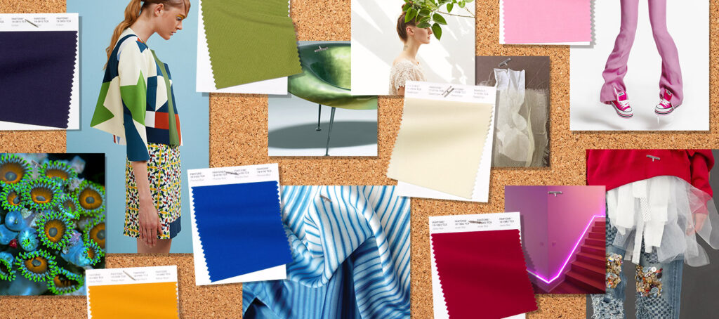
The report is published for the fashion industry by the Pantone Color Institute and features 12 stand-out colours as well as four classic neutrals, but just as we did for spring/summer 2019, we’ve made it easier for you by giving you our verdict on our top 10.
Our top 10 Pantone colours for autumn/winter 2019-20
Here are our top 10 Pantone colours for autumn/winter 2019-20:
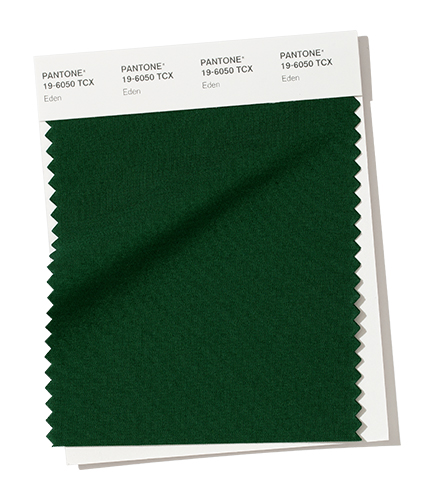
- Eden 19-6050
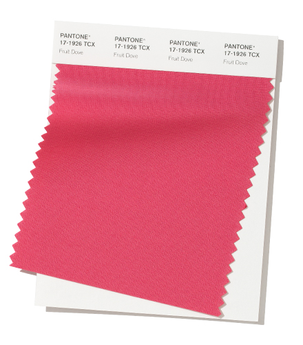
- Fruit Dove 17-1926
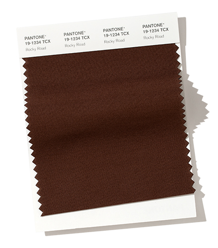
- Rocky Road 19-1234
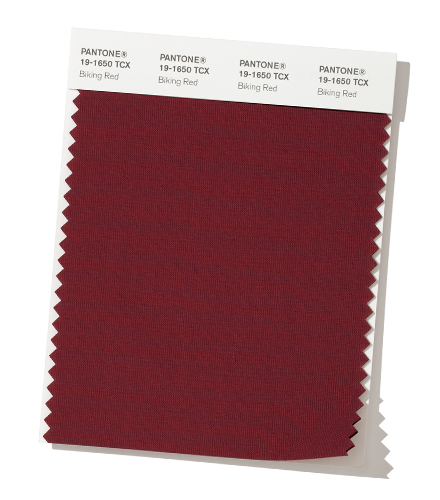
- Biking Red 19-1650
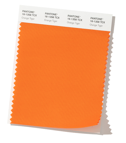
- Orange Tiger 16-1358
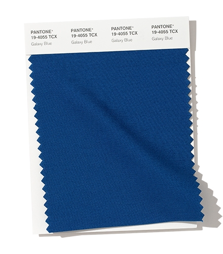
- Galaxy Blue 19-4055
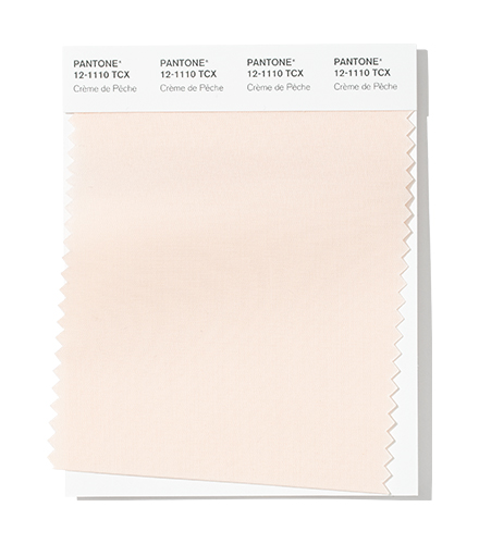
- Crème de Pêche 12-1110
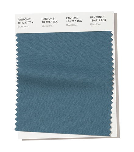
- Bluestone 18-4217
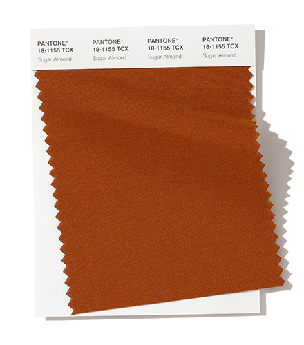
- Sugar Almond 18-1155
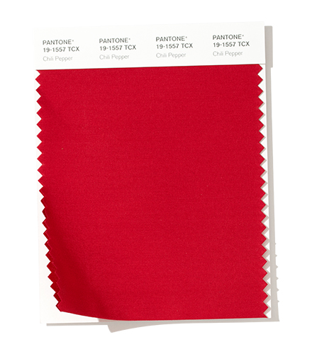
- Chili Pepper 19-1557
More about our chosen colours below.
|
This natural hue links back to Pantone’s overarching theme of colour from nature. Eden is distinguished and rich, invoking a real sense of sophistication. Eden is the key colour for autumn/winter 2019-20, as it is extremely useful wherever confident sophistication is needed in design. Expect to see this colour worn at awards ceremonies and on the red carpet.
It’s been 18 years since Legally Blonde hit the big screen, and now Fruit Dove pink is finally being recognised as a power colour. Elle Woods would be proud. Fruit Dove is quintessential extrovert individuality. It works well in block colours, like patent heels and an LPD (little pink dress), as an accent colour in gorgeous patterned scarfs or as a colour in artwork or soft furnishings to bring much-needed warmth to the home.
Grounded yet rich, this is the colour of only the finest of chocolate. Rocky Road is the perfect neutral for vibrant blues as it does not detract from the overall effect. Use it in larger furniture like sofas to interact with bright light fixings, artwork and flooring, or even feature walls. In clothing, use Rocky Road as the accent colour for a contrasting outfit, think red and black with a brown leather purse. Rocky Road is another colour suited to leather, but think about what other luxurious fabrics you can use – suede, camel and Egyptian cotton being some.
This is such a strong shade, which invokes feelings of adventure and exploration. We can see Biking Red being ideal for strong make-up shades, tuxedos in warmer fabrics, or even for car upholstery and tech device accessories.
A vibrant colour that draws on the energy of summer to pick you up on dull days. Orange Tiger is crying out to be used as bold as possible, in whole garments, streetwear or suits, ties and scarves or large furniture.
This is a deep, almost endless blue, embodying deep oceans. Galaxy Blue can be the highlight of a confident business outfit or a more casual evening dress or suit. As menswear looks to increasingly more adventurous fabrics and colours, Galaxy Blue offers a middle ground between restrained Navy and vivacious Sky Blue.
Crème de Pêche is a light and delicate neutral that draws in the viewer. Use it on statement fabrics like faux fur or animal print to add a little rebellion to outfits for business or pleasure, or as a base outfit colour that can be accessorised with vivid tones.
Calm yet focused, Bluestone is the colour for those who foster creativity and individuality on their own terms. Pare back vivid oranges and pinks in patterns or looks, or use Bluestone to add juxtaposition between the almost pastel and vivid pinks or blues. Think cosmetics, bathroom furnishings and even kitchen units, if light allows.
A sweeter brown that is playfully professional. While the obvious fabric choice is leather, it pairs fantastically in patterns with dark blues, or stands up well on its own as a warmer neutral for accessories or tactile fabrics like rugs and cushions.
An example of how designers are not necessarily looking to provide warmth, but heat. Hot, saturated hues are often utilised in summer palettes. However, this passionate confident shade can brighten up any day or outfit when used sparingly. As a true power move, women’s suits and men’s outerwear and trainers are both fantastic applications for the bolder end user. |
And what of the rest of the Pantone report?
There are, of course, 16 shades included in Pantone colours for autumn/winter 2019-20. We’ve given you our top 10, but what about the remaining six? We couldn’t let the opportunity pass to give you our verdict on these as well, so here’s what we think.
A sophisticated tone conjuring visions of pearls and pastel cosmetics. It exudes warmth and confidence and contrasts vividly with inky blues and blacks. For a truly impressive look, pair peach with strong deep reds and oranges in the home for a bold, bright and self-assured look.
A rich, refreshing green that adds splashes of colours into neutral outfits or even amazingly-bold chalk-painted wood. Also ideal for doors, windows or military-inspired items.
Perfect for suede or faux suede, such as jackets or dresses, or soft furnishings like rugs and cushions. Create a truly bold outfit by pairing it with another vibrant shade like Chili Pepper.
A confident, sophisticated yet understated colour that loves to be paired with strong colours when used as an accent block or main flat colour.
Inky, mysterious, alluring. Use it on its own to present confidence, or as a foundation for contrast with bright, light colours like Vanilla Custard and Fruit Dove.
Vanilla custard is confidently understated. Use it to promote the feeling of internal strength, empowerment and integrity. Perfect for luxury linens, cashmere, or as the base colour for striking outfits, or pantsuits, bold blouses or dresses with sparkling jewellery. In the home, it is a warm neutral that needs bold splashes of contrast to come to life.
Get your hands on Pantone colours
So that’s our top 10. If there’s a colour that really stands out for you, and you want to know more, we’re here to help. All colours mentioned are featured in the Cotton Swatch Library (Full size swatches), Planner (swatch chips) and Passport (smaller swatch chips).
VeriVide has been an official Pantone distributor for more than 10 years. As a Master Distributor of Pantone, we hold stock of most Pantone products and are able to order out-of-stock items for you for delivery usually within 10 days.
We are the only UK stockist of SMART fabric swatches, holding stock of every colour in the fashion and home range.