


The dust has barely settled on New York Fashion Week but here, at VeriVide, we’re still basking in the glow of Pantone revealing their top shades for spring/summer 2019.
The Pantone Fashion Colour Trend Report is announced twice a year and, this season, the message is clear.
Pantone’s mindset for spring/summer 2019 is firmly on the future by releasing “empowering colours that provide confidence and spirit”.
The attention-grabbing colours Pantone have selected are “uplifting, joyful hues that lend themselves to playful expressionism and take us down a path of creative and unexpected combinations.”
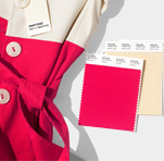
This season’s report features 12 stand-out colours, as well as current takes on the four classic neutrals, and all can be seen and bought from VeriVide, whether it’s a single swatch you’re after or a more complete set, such as the Cotton Chip Set.
The colours are, say Pantone, “vibrant without being overpowering”, with highlighted shades illustrating their “desire for authenticity and continued need for creativity and relatable, accessible design”.
Pantone Colour Institute’s executive director Leatrice Eiseman said: “From a psychological standpoint, when you look at what the colours mean, the hotter colours particularly in the red family are all about empowerment.
“That’s a word that has gotten some play that is really going to show itself in the spring collections. Confident, uplifting, joyful hues, but the undercurrent is empowerment to all of them.”
All of which has empowered VeriVide to pick our 10 hottest colours from this latest palette. And not only that, we hope to give you some suggestions as to how they could be applied. So, without further ado…
No.1 – Jester Red (Pantone 19-1862)
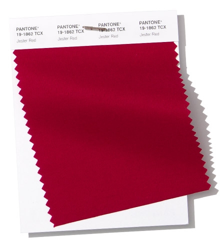
Pantone say: “Adding depth and intensity, Jester Red combines rich elegance with urbanity.”
VeriVide say: Jester Red is all about empowerment, and we see this colour being perfectly applied in sportswear, in particular polo shirts. It sends out a definite signal of strength and power, and there was no better embodiment of that than Roger Federer wearing a deep red shirt during the 2018 US Open.
No.2 – Turmeric (Pantone 15-1264)
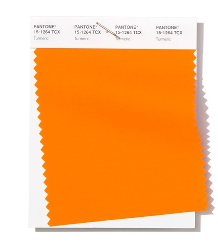
Pantone say: “Turmeric is an enlivening orange that infuses a hint of pungency into the palette.”
VeriVide say: Turmeric is a superfood so it’s very en vogue right now. Where do we see this rich, bold colour being utilised? Why not use Turmeric in the home, bringing a vibrant energy to small textile accessories like scatter cushions.
No.3 – Living Coral (Pantone 16-1546)
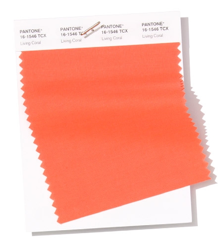
Pantone say: “Living Coral is an affable and animating shade whose golden undertone gives it a softer edge.”
VeriVide say: The very name shouts out “sea” – and we can see Living Coral, which is flattering to so many skin tones, making a splash in women’s beachwear, bikinis and swimsuits. Just ask Kourtney Kardashian, who is a firm fan of coral colours.
No.4 – Pink Peacock (Pantone 18-2045)
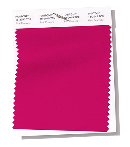
Pantone say: “The tantalisingly theatrical Pink Peacock fans out to a feast for the eyes.”
VeriVide say: A striking colour without being overwhelming, Pink Peacock puts a heavy dose of fun into pink. This could be the perfect colour for accessories, such as handbags or purses, especially when spring arrives. A favourite for millennials.
No.5 – Pepper Stem (Pantone 17-0542)
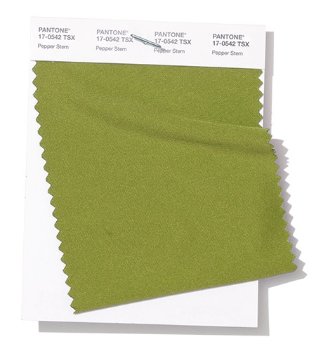
Pantone say: “Zesty yellow-green Pepper Stem encourages our desire for nature’s healthy bounty.”
VeriVide say: Pepper Stem screams nature and the environment, so what better use than for rugged outerwear for men and women. And it fits into that “empowerment” theme quite snugly.
No.6 – Princess Blue (Pantone 19-4150)
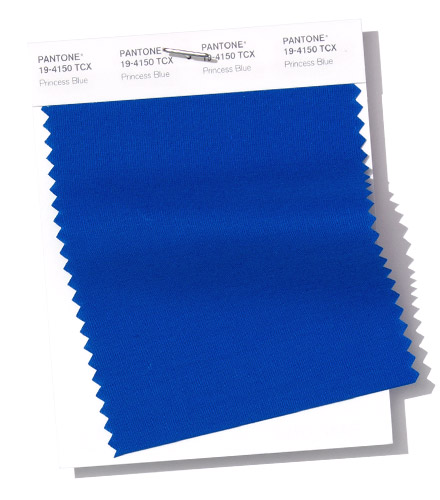
Pantone say: “Princess Blue, a majestic royal blue hue, glistens and gleams.”
VeriVide say: It’s hard to go wrong with a royal blue, and Princess Blue is another crowning moment from Pantone. This colour is much loved by Megan Markle, so formal womenswear seems to be the perfect match-up for this majestic colour. For us, Royal Blue is the perfect power outfit colour!
No.7 – Toffee (Pantone 18-1031)
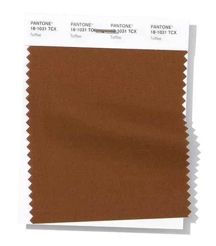
Pantone say: “Deliciously irresistible, tasteful Toffee whets the appetite.”
VeriVide say: While this brown is not as vibrant as the colours above, it is nevertheless deep and luxurious. Perfect, then, for upholstery. Who wouldn’t want to sink into a Toffee sofa?
No.8 – Mango Mojito (Pantone 15-0960)
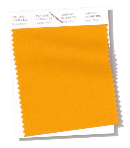
Pantone say: “The golden yellow Mango Mojito feeds our craving for pleasant comforts.”
VeriVide say: Yellow is a colour constantly on the up and, as the name suggests, Mango Mojito is a hot summer colour. For those more adventurous fashionistas, Mango Mojito would be a fantastic colour for bright and breezy culottes.
No.9 – Eclipse (Pantone 19-3810)
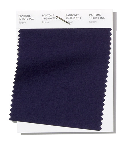
Pantone say: “A deep blue redolent of the midnight sky, thoughtful Eclipse is both serious and mysterious.”
VeriVide say: There is an air of mystery around this deep, sultry colour, while it also exudes the plush and exotic, so Eclipse seems the perfect fit for women’s lingerie and underwear.
No.10 – Sweet Corn (Pantone 11-0106)
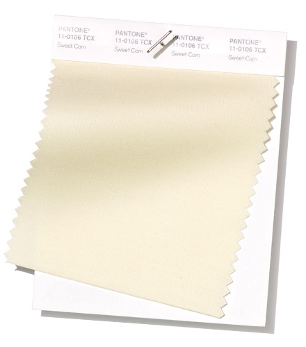
Pantone say: “Sweet Corn tempts with its soft and buttery attitude.”
VeriVide say: Like Eclipse, Sweet Corn is from Pantone’s neutral range for spring/summer 2019, and provides a calm foundation for distinctive looks. Subtle off-white shades will always be around, and we see Sweet Corn, with its warmer qualities, being the perfect colour for luxurious bedding.
Other Colours
The swatches below illustrate some of our favourite colours from the Pantone SS/19 trend report. The other colours are shown below
Fiesta (Pantone 17-1564)
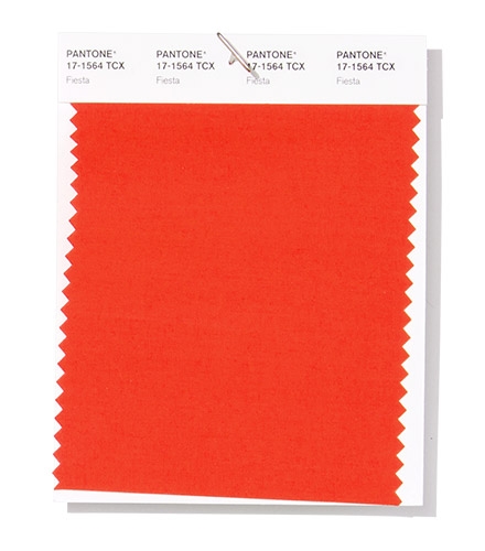
A vibrant colour that radiates energy in every application.
Aspen Gold (Pantone 13-0850)
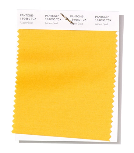
A cheerful yellow tone that reminds us of gorgeous flower meadows.
Terrarium Moss (Pantone 18-0416)
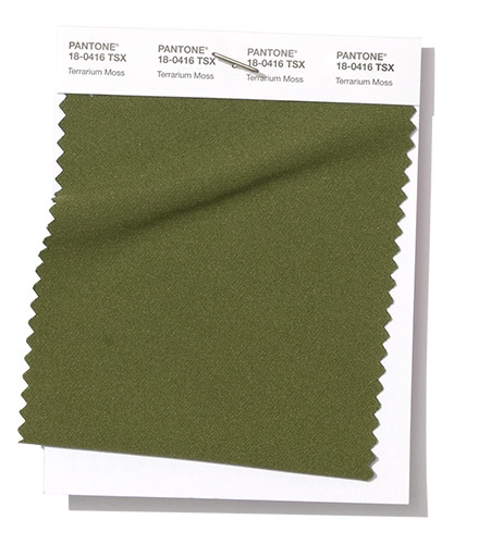
Terrarium is a versatile colour perfect for fashion-forward technical streetwear and beautiful swimwear.
Soybean (Pantone 13-0919)
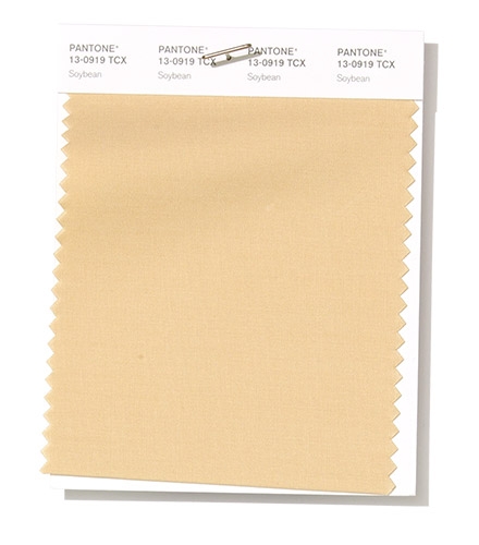
Soybean is a warmer neutral that would be excellent as a base colour for large home textiles such as curtains and sofas.
Brown Granite (Pantone 19-0805)
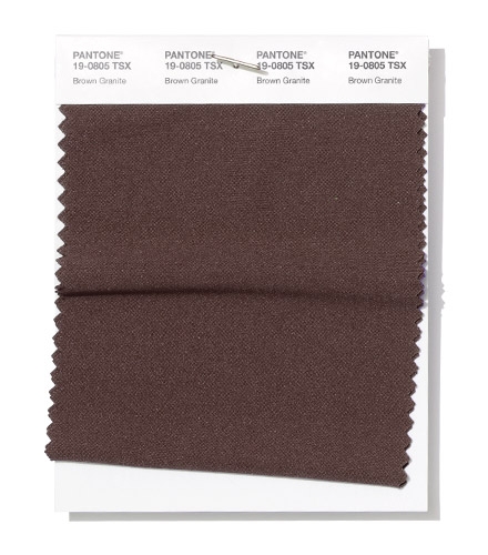
A strong, natural tone, Brown Granite is a great base colour for accent accessories such as throws and rugs.
So that’s our top 10. If there’s a colour that really stands out for you, and you want to know more, we’re here to help. All colours mentioned are featured in the Cotton Planner, except Pepper Stem, Brown Granite and Terrarium Moss, which can be found in the Pantone Polyester Swatch Set or as individual swatches.
VeriVide have been an official Pantone distributor for more than 10 years. As a Master Distributor of Pantone, we hold stock of most Pantone products and are able to order out-of-stock items for you for delivery usually within 10 days.
We are the only UK stockist of SMART fabric swatches, holding stock of every colour in the fashion and home range.