


Drumroll please… Pantone has published their ‘Fashion Color Report Spring 2017’ and nominated their top 10 colours!
Which Pantone colours were lucky enough to make it?
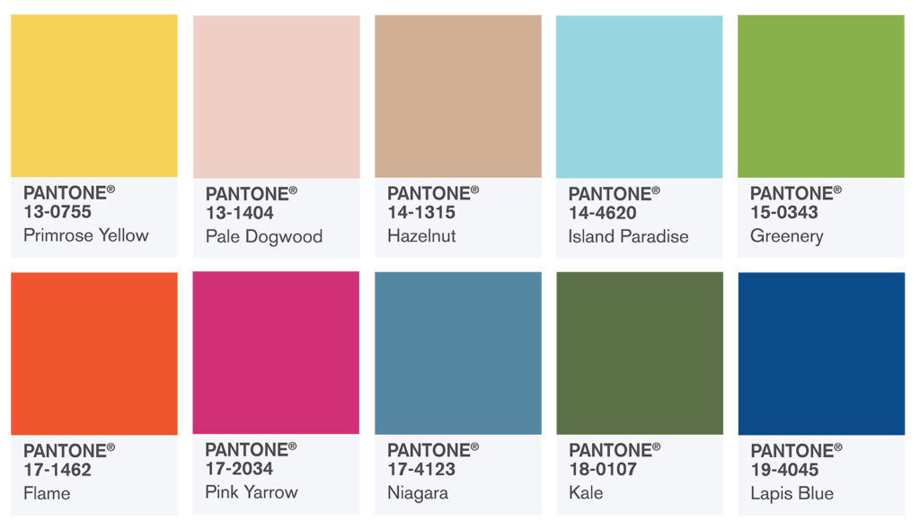
The following Pantone colours were named in the ‘Fashion Color Report Spring 2017’:
- Primrose Yellow (13-0755 TCX) – Primrose Yellow sparkles with both heat and vitality. It’s warmth is truly inviting and this joyful shade is enthusiastic and reminds us of good cheer and sunny days.
- Pale Dogwood (13-1404 TCX) – Pale Dogwood is a tranquil, quiet and peaceful shade which gives off an aura of innocence and purity. This subtle pink has a soft touch and a healthy glow.
- Hazelnut (14-1315 TCX) – Hazelnut is a key neutral colour for spring. It has a certain earthiness to it and is unpretentious, warm and great as a transitional colour, effortlessly connecting the seasons.
- Island Paradise (14-4620 TCX) – Island Paradise is a refreshing and cool aqua that speaks to our dreams of the great escape. This shade reminds us of tropical settings and our desire to relax, escape and unwind.
- Greenery (15-0343 TCX) – Pantone’s Colour of the Year 2017, Greenery is a refreshing, tangy-yellow-green that invites us to explore, experiment and reinvent. Representative of flourishing foliage, this shade allows us to take a deep breath and oxygenate.
- Flame (17-1462 TCX) – Flame, a fun loving red-based orange, is flamboyant and vivacious. This shade adds a great fiery heat to the spring 2017 palette.
- Pink Yarrow (17-2034 TCX) – Pink Yarrow, is a wonderfully tropical, festive and whimsical shade that both tempts and tantalizes. This shade is captivating and can lift spirits and get the adrenaline pumping!
- Niagara (17-4123 TCX) – Niagara is the comfortable and dependable shade on the spring 2017 palette. The blue shade is a classic denim-like blue that speaks to our desire for ease and relaxation.
- Kale (18-0107 TCX) – Kale advocates the great outdoors and a healthy lifestyle. Like the more vivacious Greenery, Kale is another foliage-based green that conjures up desires to connect with nature.
- Lapis Blue (19-4045 TCX) – Lapis Blue conveys high levels of energy and is a strong, confident colour and has an inner radiance.
More about the Pantone’s ‘Fashion Color Report Spring 2017’
In conjunction with the iconic New York Fashion Week, Pantone’s ‘Fashion Color Report’ gives readers an in-depth overview of the colours that fashion designers are using in their spring 2017 collections. The report features the top 10 shades which you will see on the runway and therefore is your essential guide to the season!
Few words from Leatrice Eiseman, Executive Director of the Pantone Color Institute
“One of the things that we saw this year, was a renewed sense of imagination in which color was appearing in context that was different than the traditional,” said Leatrice Eiseman, Executive Director of the Pantone Color Institute. “Reminiscent of the hues that surround us in nature, our Spring 2017 Fashion Color Report evokes a spectrum of emotion and feeling. From the warmth of sunny days with PANTONE 13-0755 Primrose Yellow to the invigorating feeling of breathing fresh mountain air with PANTONE 18-0107 Kale and the desire to escape to pristine waters with PANTONE 14-4620 Island Paradise, designers applied color in playful, yet thoughtful and precise combinations to fully capture the promises, hope and transformation that we yearn for each Spring.”