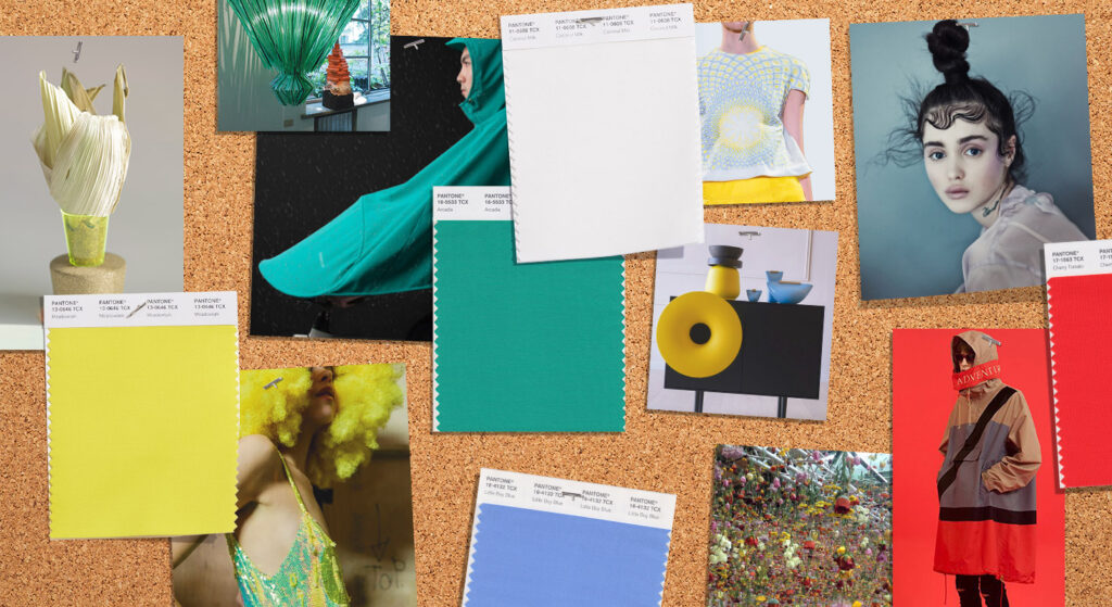
Most of you are probably already aware, but for those who aren’t, Pantone have announced their ‘Fashion Color Trend Report for Spring 2018’, which is ever so exciting!
Why do Pantone do these trend reports?
There is more info about why Pantone do this report in our previous blog, ‘Have you checked out Pantone’s Fall 2017 Fashion Colour Report’, but as a quick explanation, the report offers a colour overview which highlights the top colours fashion designers showcased at NY Fashion Week.
What’s on trend for next year?
There has been a recent trend in consumers truly embracing colour and designers are fully aware that they need to show more colour in their collections which is evident in the Pantone trend Spring 2018 report.
Does this mean goodbye to neutral and classic shades?
Pantone are not ignoring the neutral or classic shades, as these are the core basics and seasonal essentials. These shades work well on their own as well as providing the landscape for colour complexity.
Need evidence? Take the addition of Pantone’s four classic colours in the report, which it has never been done before as evidence. The colours chosen transcend all seasons and provide structure to any wardrobe.
Which shades have made it into the report?
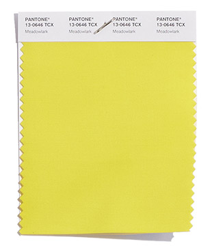
PANTONE 13-0646 Meadowlark – Such a lovely shade is Meadowlark. It is confident and outgoing, this bright yellow shade highlights the spring season, giving joy and illuminating the world around us.
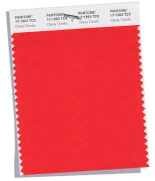
PANTONE 17-1563 Cherry Tomato – Cherry Tomato demands attention, this tempestuous orangey red exudes heat and energy, being courageous this shade does not want to be ignored…
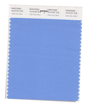
PANTONE 16-4132 Little Boy Blue – This shade suggests expansiveness and continuity, described as an azure blue it reassures the world with a promise of a new day.
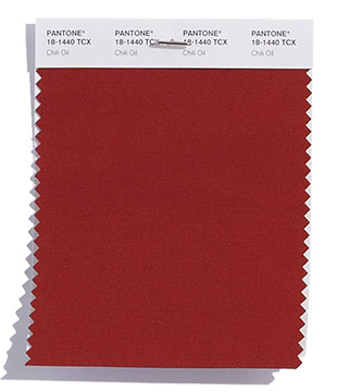
PANTONE 18-1440 Chili Oil – This shade is an earthy brown based red which adds flavour to the overall palette.
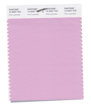
PANTONE 14-3207 Pink Lavender – What a shade, Pink Lavender is soft and romantic. This violet rose shade is charming with its soothing sense of quiescence.
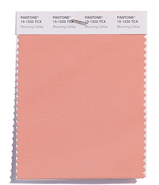
PANTONE 15-1520 Blooming Dahlia – Subtle yet suggestive, this shade beckons anyone with its unstated appeal and alluring scent.
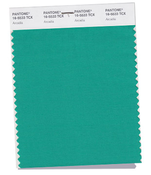
PANTONE 16-5533 Arcadia – Arcadia combines retro and modern with its cooler and cleaner take on green. There are hints of blue undertones taking us into a new direction for spring 2018.
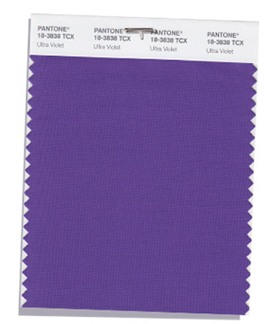
PANTONE 18-3838 Ultra Violet – Magical Ultra Violet conveys originality and ingenuity with its distinctive and complex purple shade. It fascinates and intrigues.
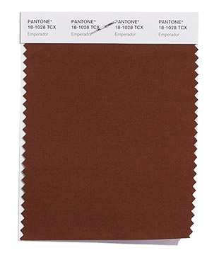
PANTONE 18-1028 Emperador – This rich chocolate infused shade adds strength and substance to the palette. A season must have!
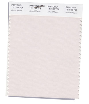
PANTONE 12-2103 Almost Mauve – Fantastically name Almost Mauve teases us with its gentle petal like touch which is both delicate and ephemeral. This shade adds a sense of nostalgia to the palette.
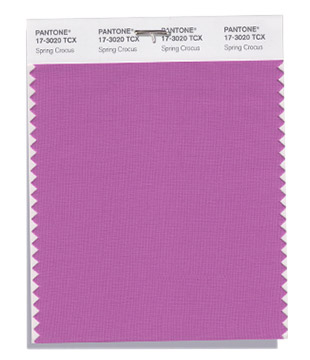
PANTONE 17-3020 Spring Crocus – This shade is witty and expressive with its flamboyant and tantalizing fuchsia shade, summoning you to its beguiling charm.
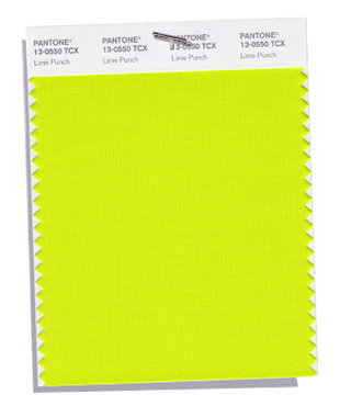
PANTONE 13-0550 Lime Punch – Wow, just wow! This shade is sharp and pungent hitting a chord with its strident and striking citrus like presence.
Let’s not forget about the classics…
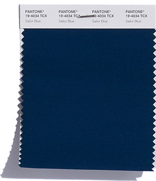
PANTONE 19-4034 Sailor Blue – Described as the navy like sailor blue, this shade anchors the overall palette.
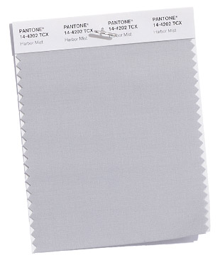
PANTONE 14-4202 Harbor Mist – This mid-tone dove grey, this shade helps to solidify the spring 2018 palette.
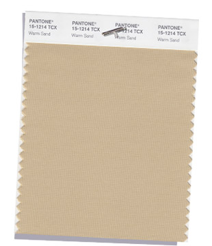
PANTONE 15-1214 Warm Sand – So comforting is Warm Sand. This neutral shade effortlessly connects the seasons.
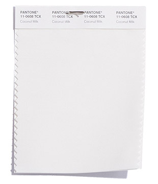
PANTONE 11-0608 Coconut Milk – Coconut Milk signifies the classic mainstay of a white and/or off-white for the spring 2018 season.
What now?
If you don’t have these colours, we would highly recommend that you start adding them now. Visit the Pantone Smart Colour Swatches section on our site. Scroll down, type in either the TCX code or colour name, add to basket and it will be on its way to you!
Important! Order before 12:30pm and it will go in the post on the same day, meaning you will have it by the morning!

