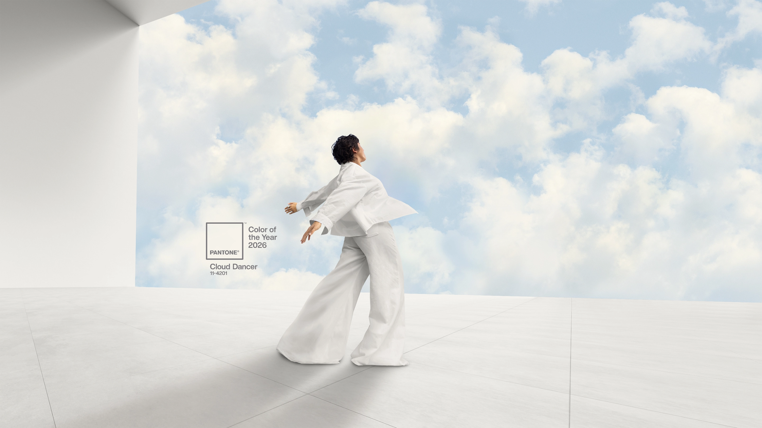


Every year Pantone collaborate with designers and influencers to develop colour palettes for the Spring and Fall. These colour palettes set the tone for all the major fashion designers, interiors, paints and more throughout the year. We take a look at the Pantone Colour Reports for Spring and Fall from this year.
If you need to invest in the colours in these reports to assist with your designs for 2015 VeriVide as the only UK stockist can supply individual Smart swatches for £8.00 each plus delivery & VAT. For more information email pantone@verivide.com or to place an order follow the link to our online shop https://www.verivide.com/product/pantone-smart-colour-swatches
Spring
Both Colour Reports for 2015 have centred around nature. The Spring Collection entitled En Plein Air featured ‘cooler and softer colour choices with subtle warm tones follow a minimalistic en plein air theme, taking a cue from nature.’
Leatrice Eiseman, Executive Director, Pantone Color Institute, said: “Many feel compelled to be connected around the clock because we are afraid we’ll miss something important. There is a growing movement to step out and create ‘quiet zones’ to disconnect from technology and unwind, giving ourselves time to stop and be still. Color choices follow the same minimalistic, ‘en plein air’ theme, taking a cue from nature rather than being reinvented or mechanically manipulated. Soft, cool hues blend with subtle warm tones to create a soothing escape from the everyday hustle and bustle.”
Read the full Pantone Spring 2015 Colour Report here [http://www.pantone.com/pages/fcr/?season=spring&year=2015]
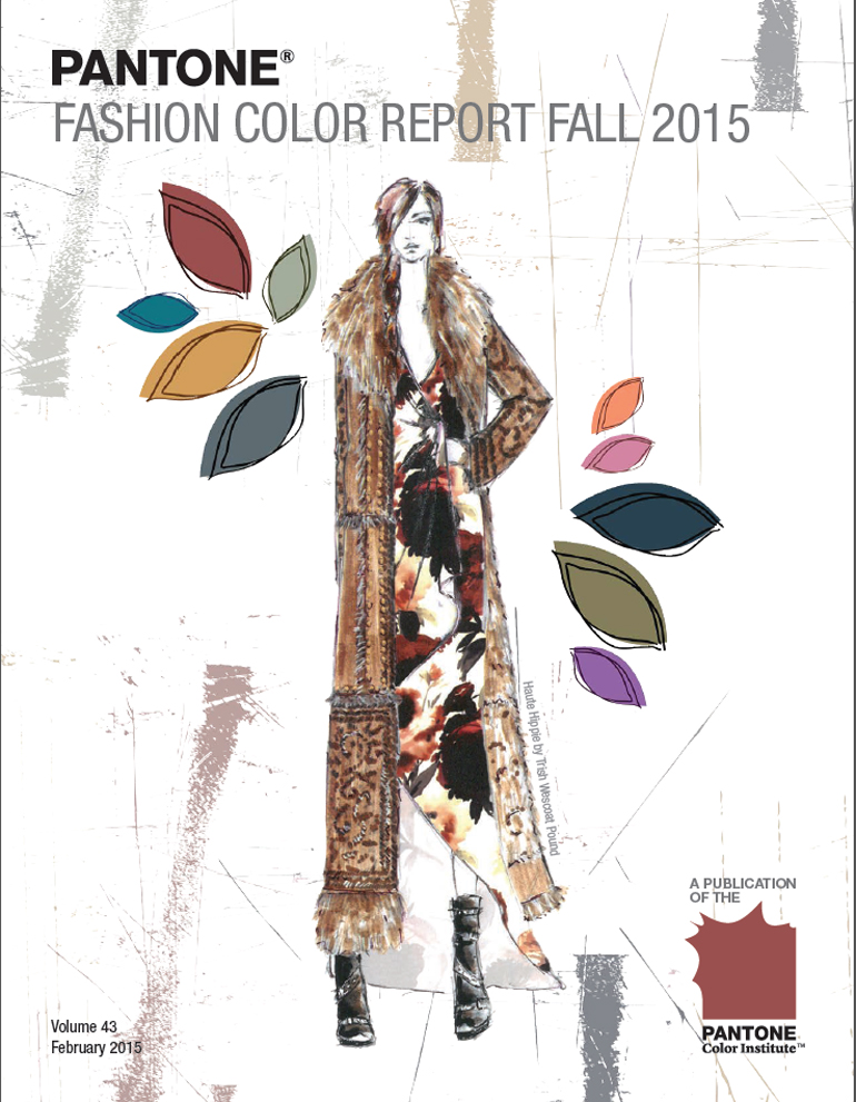
Fall
Continuing the natural theme in 2015 the Fall Report has been entitled An Evolving Colour Landscape. ‘This season displays an umbrella of accord that weaves earthy neutrals with a range of bold color statements and patterns to reflect a landscape of hope, fun, fantasy and all things natural.’
Leatrice Eiseman, said: “The colors are evocative of a love for nature and a timeless appreciation for warmth and security, which are conveyed through naturally inspired colors that remind us of things that are real and protective. This Fall, designers’ pay homage to progressive moments in American history – from the seductive ‘20s to the bohemian hippie and modernists of the ‘60s and ‘70s – while stringing together an affection for colors and styling that are innately easy to wear by both men and women. Juxtaposition of color from opposite sides of the spectrum emphasizes poise and confidence on the runway. The Fall 2015 palette is rooted in multi-faceted, androgynous colors that can be worn to portray effortless sophistication across men’s and women’s fashion; it is the first time we are seeing a truly unisex color palette.”
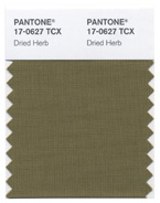
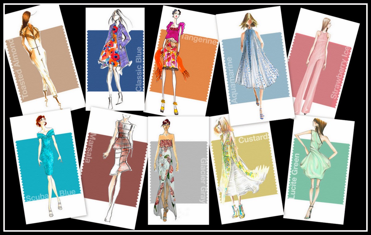
An olive green shade once thought of as strictly safari or military, PANTONE 17-0627 TCX Dried Herb has been elevated into a color we now perceive as sophisticated and chic. Closely related to nature, Dried Herb is an organic shade redolent of nature’s earthy fragrances.
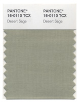
A cool and soothing greenish gray, PANTONE 16-0110 TCX Desert Sage is the ideal neutral. Timeless and unobtrusive yet at the same time stylishly powerful enough to make an impactful statement on its own, Desert Sage speaks to this feeling of naturally inspired colors that remind us of things that are real and not invented.
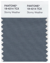
Reminiscent of the sky on a gray, overcast day, PANTONE 18-4214 TCX Stormy Weather is dependable, cool and above all, constant. Implying quality and luxury, Stormy Weather is a powerful blue gray shade that is strong, protective and enduring.
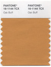
Just as the sun comes out after stormy weather to bring us cheer and a glimmer of hope,PANTONE 16-1144 TCX Oak Buff is a mellow, comforting and warming shade that brings good feelings. Another one of nature’s illustrious shades, the golden yellow Oak Buff acts to nurture and comfort.
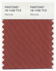
Interesting on its own and a wonderful contrast for other hues, PANTONE 18-1438 TCX Marsala is a winey red-brown that adds finesse and savoir faire. Rich and robust, Marsala incorporates the warmth and richness of a tastefully fulfilling meal, while its grounding red-brown roots point to a sophisticated, natural earthiness.
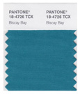
A lush and elegant teal, PANTONE 18-4726 TCX Biscay Bay splashes up against more heated tones with its cool touch. Combining the serene qualities of blue with the invigorating aspects of green, the cool and confident Biscay Bay inspires thoughts of soothing, tropical waters, taking us to a place that is pleasant and inviting.
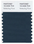
Thoughtful, contemplative and composed, PANTONE 19-4326 TCX Reflecting Pond is a cooling blue with a lot of depth. Conveying a message of credibility, Reflecting Pond is a serious shade that speaks to our need for stability and security.
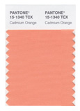
A nod to the ’60s and ’70s, PANTONE 15-1340 TCX Cadmium Orange evokes a sentiment of optimism, fun and fantasy. Both playful and sophisticated in its appeal, Cadmium Orange is a warm, welcoming and subtly dramatic orange shade that is striking enough to stand on its own or act as a bold contrast.
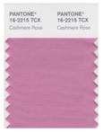
A play on the ’60s with a twist of today, PANTONE 16-2215 TCX Cashmere Rose is a tactile and soft pink hue that renders exactly what it promises. Cultivated in its richness, Cashmere Rose is a gentle and composed pink that is more upscale than downtown.
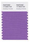
Indicative of our affection for color, PANTONE 17-3628 TCX Amethyst Orchid is the jewel in the crown.Intriguing, vibrant and somewhat sensual, the enigmatic Amethyst Orchid is an extraordinary hue that is unique, bold, creative and exciting.