Search
 Account
 Basket


Save the Date! Thursday 3rd December 2026 is the launch date for the Pantone Color of the Year for 2027.
The announcement of the Pantone Color of the Year has become a pop culture phenomenon, commanding attention from the global design community and billions of colour enthusiasts. For the first time this year’s announcement will be made at a public event instead of to industry insiders. If you are lucky enough to be in Miami go along to the Rubell Museum between 11am and 6pm EST to explore the cultural influences behind the colour through immersive installations, workshops and brand collaborations. Those not able to attend can follow VeriVide and Pantone on social media to see the announcement at 4pm GMT.
How is Pantone Color of the Year chosen?
Pantone were the first to create a colour of the year. It was originally created by the Pantone Color Institute in 1999, with the aim of educating the design community in the relationship between culture and colour. The first Color of the Year was announced for 2000 and was Cerulean Blue 15-4020 TCX . Other trend companies and colour related industries have followed Pantone’s lead and now choose a colour of the year, paint companies especially use colours of the year to inspire home decorators.
The selection process is given a great deal of consideration and trend analysis, and Pantone’s colour experts comb the world looking for new colour influences. Colour trends can be found from new technologies, exotic travel destinations, toys and games, animation and films, street fashion and sport. After much debate a consensus is reached on the most influential colour for the following year.
Whatever they reveal, we can expect the Color of the Year to have a major impact during the following 12 months. Due to the cultural significance of the colour of the year, the colour will be used in brand collaborations from beauty to home products and fashion to technology.
Past Pantone Colors of the Year


What do you think will be Pantone Color of the Year 2027?
One of my favourite activities at this time of year is to try to predict which colour will be chosen for the Pantone Colour of the Year. I review the popular colours purchased recently by VeriVide’s customers as they develop product ranges for 2027, and the trend reports from the Spring fashion shows. One of the first things I do is to check on the previous Color of the Year colours as they rarely repeat a hue within 3 to 4 years.
Here are some colour families which could provide the Colour of the Year for 2027:
Warm Neutrals
Last year’s COY was Cloud Dancer 11-4201 TCX, described by Laurie Pressman as “Similar to a blank canvas, Cloud Dancer signifies our desire for a fresh start….” “A conscious statement of simplification, Cloud Dancer enhances our focus, providing release from the distraction of external influences.” and “a key structural colour whose versatility provides scaffolding for the colour spectrum, allowing all colours to shine.” Widely criticised for being a non colour, nevertheless Cloud Dancer was prominently used in furniture, interior décor, beauty and packaging.
Recently companies seem to be selecting warmer neutral tones such as Antique White 11-0105 TCX, Buttercream 11-0110 TCX, Shortbread 12-0710 TCX and Anise Flower 12-0717 TCX. However, I am sure that Pantone will not risk another pale neutral this year.
Another neutral option is brown and chocolate brown has continued to be popular, hues have shifted towards the earthy tones of Cambridge Brown 19-1242 TCX, Shopping Bag 19-1213 TCX and Sparrow 18-1404 TCX.
Bright uplifting shades
For the last three years the chosen colours have been warm and gentle, is it time for a vibrant colour to be chosen? Pantone’s Fashion Trend Report for New York Fashion Week Spring/Summer 2027 described the palette colours as “uplifting shades whose youthful energy lightens the mood, reflecting a zest for life” and “showcasing an appreciation of hues inspired by our natural environment”
Green
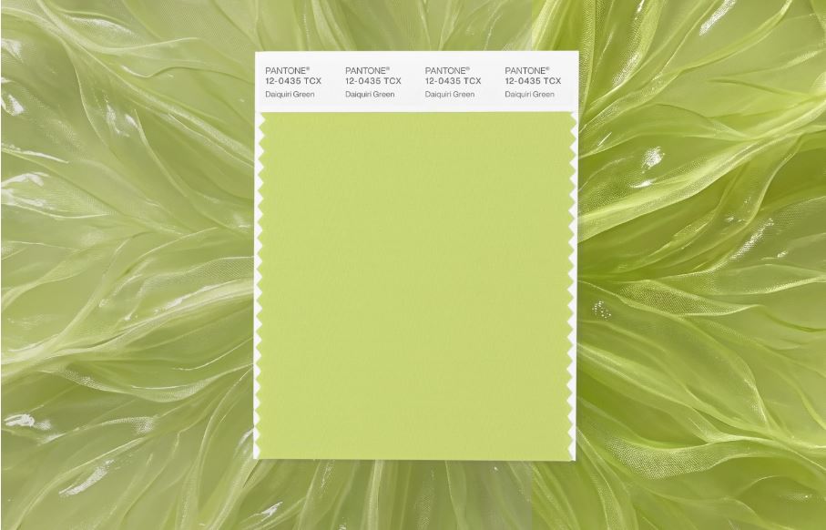 Several paint companies have chosen green for their colour of the year from Dulux Soulful Sage™ a soft, radiant green to Sherwin-Williams Celery, a lively yellow-green shade. Expect to see green feature walls, furniture and homeware accents, fashion has also adopted bright greens with several shades seen at the recent fashion weeks.
Candidates from the green family include:
Daiquiri Green 12-0435 TCX – a bright, crisp lime delivering a refreshing citrusy punch. Tarragon 15-0326 TCX, a herbal green with subtle botanical undertones, and Green Tea 15-6428 TCX, a leafy green.
An alternative colour is Waterfall 15-5516 TCX, a cascading blue green that invigorates the senses and boosts your mood.
Darker greens have also been popular recently with Pine Grove 19-5406 TCX and Ponderosa Pine 19-5320 TCX regularly purchased.
Blue
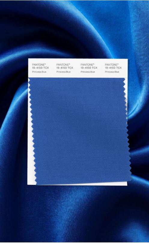 Both Elle and Coveteur reported that cobalt blue is here to stay, featuring in both the Autumn/winter 2026 and Spring/Summer 2027 international fashion week shows from a number of designers. Cobalt blue was seen at Stella McCartney, Victoria Beckham, Chanel and Givenchy. Cobalt blue feels bold and electric, but sophisticated and chic at the same time.
Pantone chose the vibrant Princess Blue 19-4150 TCX to represent the shade in its NYFW SS 2027 report, Princess Blue is a majestic blue whose regal appearance projects dignity and grace. Possible alternatives include Dark Sapphire 19-4020 TCX and Ultramarine 17-4037.
At London Fashion Week there was not just one blue but many. From the soft, romantic powdery tones of Zen Blue 14-3912 TCX or Kentucky Blue 15-3915 TCX, to the floral Bel Air Blue 15-3932 TCX and the bolder Dresden Blue 17-4433 TCX.
 Pink
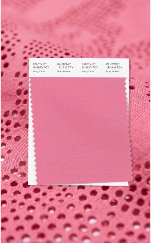
Along with Blue, Pink shades have been extremely popular in the latter part of 2026. Pantone highlighted Rosy Future 15-1910 TCX in the New York Fashion Report, this is a bright and happy pink full of promise. They also chose Langoustino 16-1440 TCX, an oceanic coral whose rich sun-kissed vibrancy is inspired by the natural colour of the langoustine crustacean. Popular pinks include Sachet Pink 15-2216 TCX, Aurora Pink 15-2217 TCX, Pink Cosmos 16-2122 TCX and Cherry Blossom 13-3207 TCX.
Paler, ethereal options also featured on the catwalks and in customers baskets especially Chintz Rose 13-1408 TCS, Crystal Pink 12-1605 TCX and Chalk Pink 13-1904 TCX
Now you have all the information, what do you think will be Pantone Color of the Year 2027?
I am guessing Daiquiri Green 12-0435 TCX, but of course I could be wrong! Pantone often surprise us with their choice – for example in 2022 they named a colour which was not in the Pantone books (Very Peri 17-3938). Sometimes they even select two complementary colours.
Keep in touch to find out what colour is chosen!
Get hold of all of the colours mentioned by ordering individual colour swatches or upgrading to one of the new Pantone FHI books which include the dualities colours.
About the author:
Georgina Boulter C. Col A.S.D.C is a Chartered colourist with years of experience dyeing fabrics for apparel. For the past 20 years she has trained customers of VeriVide on visual colour matching to Pantone colour standards. Many UK brands buy their Pantone from Georgina enabling her to spot colour trends before they arrive in store.