


The Importance of Metallics in Print and Packaging
Whether in gold, silver, copper, or custom hues like rose gold and iridescent tones, metallics do more than dazzle. They communicate sophistication, craftsmanship, and brand identity.
Why Metallics Matter
- Instant Perception of Quality: Metallic inks and foils signal luxury, craftsmanship, and exclusivity. From skincare boxes to wine labels, they suggest the product and brand are high-end.
- Unmatched Shelf Presence: Metallic elements catch and reflect light, making packaging more visible in crowded retail spaces, often influencing purchase decisions.
- Tactile and Visual Impact: Techniques like foil stamping, embossing, and spot metallics deliver texture and shine, creating a multisensory experience that’s memorable and screen-proof.
- Versatile Across Industries: From tech and cosmetics to spirits and automotive, metallics adapt to any aesthetic—offering elegance, innovation, or futuristic appeal.
- Customisable Effects: Modern print methods make metallics adaptable, from subtle accents to bold, full coverage. Options like metallic inks, foils, and digital embellishments can align perfectly with any brand identity
Metallics for packaging
Do you include metallic in your artwork? If not, the following fact is going to be a revelation for you…
According to Future Market Insights (2025)*1 The Metallic Pigments Market is estimated to be valued at USD 2.5 billion in 2025 and is projected to reach USD 4.7 billion by 2035. Growth is projected to be between 6% and 8.5% dependant on region.
The UK’s strong focus on sustainable materials and innovative pigment solutions in coatings and packaging contributes to market growth. A growing interest in decorative coatings and innovative packaging solutions is driving the adoption of metallic pigments in the UK. Combined with a rising demand for high-quality coatings and finishes in the automotive and packaging sectors this leads to the need for metallic colours.
Metallics continue to be a huge trend for the packaging industry, especially for food and beverage packaging, in personal care products and cosmetics such as shampoo, nail varnish and eyeshadows. Brands continue to invest in metallics for gift wrap, labels and special edition packaging. The graphics industry is another significant market that tries to distinguish the creative artwork by utilizing metallics in marketing and commercial collateral.
Grabbing consumers’ attention is difficult in this competitive market and more and more brands use metallics to create eye-catching and striking packaging and graphics artwork. However, there is a considerable gap between the demand for metallic colours and the actual offer from suppliers. Designers are seeking various metallic samples to provide to their suppliers as reference for what they want to produce, but most of the time it is difficult to reproduce the colour they desire.
The Solution – Pantone metallics
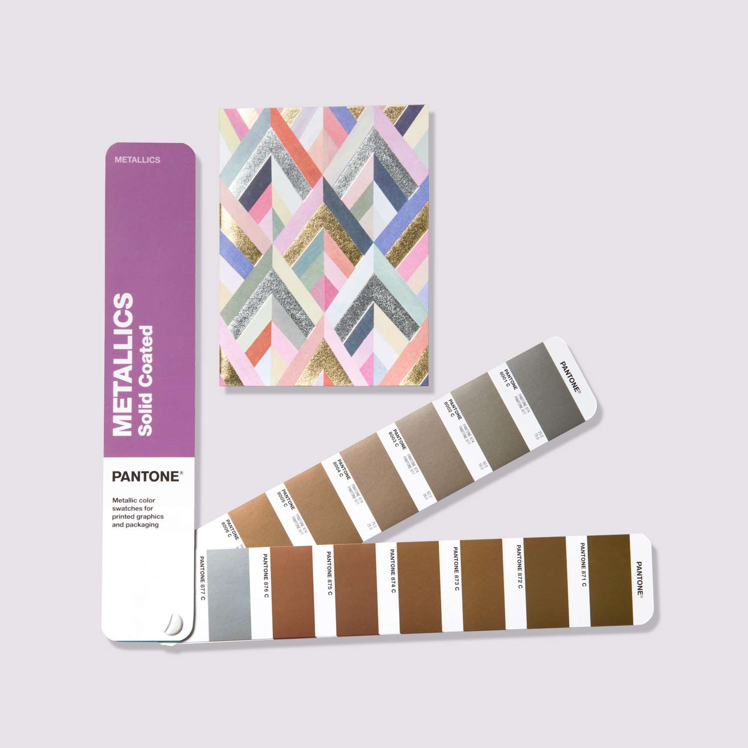
The lack of metallic colour reference guides inspired Pantone to create the Metallics range for Graphics and packaging industry. The Pantone Matching System offers 655 globally achievable metallic colours with coating options and finish references. Whether you need subtle shimmer or high-gloss drama, Pantone ensures consistency, vibrancy, and creative flexibility. Pantone’s PMS Metallics range is here to help designers achieve quickly and accurately the correct colour for metallic finishes.
Although golds, silvers and bronze were and are the top metallic colours that conquer the design world, a growing trend in metallics is more pastels and neutral hues that making design more impactful.
Following on from the recent trend of rose gold jewellery instead of white or yellow gold, this colour has been popular in packaging. Pantone brought out a new base ink, the Pantone 10412C, to help designers and printers to use it in their work.
Print Technology for metallics
Advancements in digital and offset printing make metallics more accessible and cost-effective, even for short runs or personalisation. Techniques include:
- Cold and hot foil stamping
- Metallic Pantone inks
- Digital embellishments with variable foil
Where you can use Metallics to make the product dazzling!
Now you know about 2019’s latest metallics trend and how to ensure the products you create are colour consistent with Pantone’s metallic collection, you will find below some tasteful colour combinations from Pantone on how to use the trend to give your brand a differentiating visual texture. Here are just some of the many, mesmerizing metallic design ideas out there.
Graphic Design
What better way to make your product stand out from the crowd than a little metallic? Colour is a vital part of the design process and should be one of the first elements up for consideration. Your colour selection should speak volumes about the message you wish to convey. Use Pantone printing metallics for signage, stationery such as business cards, brochures and invitations as well as event decorations.
Packaging Design
It’s pretty hard these days to catch the eye in the crowded environment of packaging design. Brands have a specific goal; to distinguish their packages on the shelf of shop stores, and require a stunning image from the packaging design, connecting directly with the consumers. The first few seconds of an impression are critical as they may be the only few seconds you get. Metallics create a luxurious feeling to the product, increasing the emotional association with consumers and helping brands to differentiate from their competitors.
Use metallics for luxury packaging of jewellery, perfumes, premium electronics and premium foods and beverage products.
Pantone Premium Metallics were developed to create this feeling of “luxury” in packaging and at the same time they are more durable, better protecting the product on the shelf. Now renamed Packaging metallics and with 54 additional colours these premium metallics have been combined with the PMS metallics into one Metallics guide.
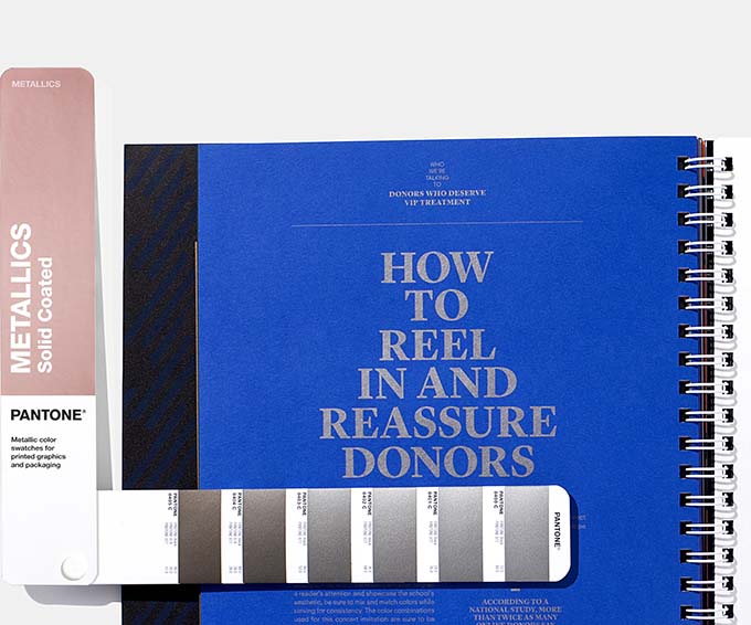
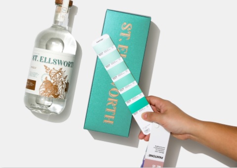
Different metallic colour options
Pantone Copper 10369C and Pantone Teal 10441C
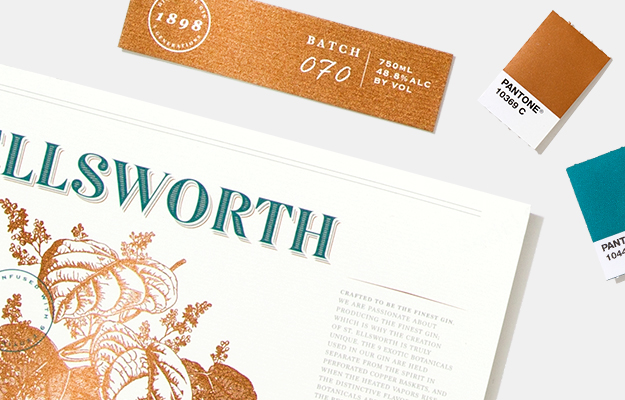
(Source: Pantone, 2019)*2
The rich copper metallic colour brings warmth to your design when combined with tasteful teal.
Pantone Vibrant Pink 10414C
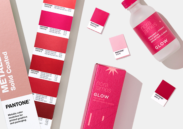
(Source: Pantone, 2019)*2
The vibrant pink celebrates the strength of the feminine and the red metallic colour adds something different to the metals that are dominating the design arena.
Rose Gold 10154C
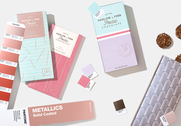
(Source: Pantone, 2019)*2
The injection of sparkling rose gold adds richness to the pastel colour palette creating a balance of elegance.
Why use Metallics in your design – more than a shine, a statement
- Communicate brand identity. Design is understated and minimalistic with statement metallic features being the focal point.
- Metallics help your print stand out and be remembered.
- Metallic printing inks for packaging is more cost-effective and saves precious time in the production in comparison with the application of foil that require a more time-consuming procedure.
- Also, metallic ink printing is more environmental friendly, as it is completely recyclable in comparison with metallic foil stamping.
- Brands are willing to invest in more premium packages, they know that Metallics provide a competitive advantage, differentiating them from their competitors. An impactful and sophisticated design with Metallics will attract instantly consumers’ attention.
“Leverage the power of color to tell your story will help you better engage and create strong emotional connections with your target audience”. (Laurie Pressman, VP, Pantone Color Institute)
Therefore, if you want to create a feel of elegance, sophisticated style, Pantone Metallics will elevate your design, making an astonishing visual impact and empowering the sales of your clients.
Whether you are a graphic or packaging designer, brand manager, printer or ink manufacturer, the Pantone Metallics Guide is the perfect tool for all designers. If you need to send colour chips to your clients or suppliers the Metallics Chip book has 6 tear out chips of all of the colours. Replacement pages are available if you use up all the chips of your favourite colours.
Buy the Pantone Metallics Guide and Metallics Chips Book – you will find everything you need. Both formats include 301 Commercial Graphics Metallics colours and 354 Packaging Metallics colours with index.
Want more insight into Metallics? Read about Pantone Metallic Shimmers for product colouration.

Sources*:
1. Future Market Insights (2025) Metallic Pigments Market Size and Share Forecast Outlook 2025-2035, available from https://www.futuremarketinsights.com/reports/metallic-pigments-market