Earlier this year Pantone, the global authority on colour and provider of professional colour standards, announced their Fall 2017 Fashion Colour Report, in time for the New York and London Fashion Weeks.
First time hearing about Pantone’s Fall 2017 Fashion Colour Report?
Pantone’s report gives the design industries a thorough, comprehensive overview of the latest colour trends, considering the colours fashion designers have used in their seasonal collections.
The fall report is one of two reports that get published twice a year for the fashion industry and is produced by the colour experts at Pantone. The report highlights the top colours for both men’s and women’s fashion for the fall season for London and New York.
Although this report is primarily for the fashion industry the fashion colour trends will permeate into other product areas and even into home decor.
Where can I access the report?
You can access the full PANTONE Fashion Color Report, Fall 2017 from their website or read on to discover the colours
For the first time Pantone have developed two separate palettes to reflect the different influences from Europe as well as the USA.
“There is a commonality between the colors we are seeing on the runway in New York and London.” says Leatrice Eiseman, Executive Director of the Pantone Color Institute. “However, individuality is evident and we are seeing a distinct difference between the shows in the two cities in the way these same colors are being combined.”
What do you think about the choice of colours? I am surprised at the lack of green in the colours chosen especially since Greenery 15-0343 is the Color of the Year for 2017; the palettes also seem to be less autumnal than in previous years with the Fall 2016 Report for example selecting many rich spicy yellows, oranges , browns and reds reminiscent of autumn leaves.
The pink, blue and lilac shades selected for Fall 2017 are muted versions of colours we associate with spring so perhaps we are moving away from two distinct colour seasons towards colours that work throughout the year?
New York Colour Palette
Image source: Pantone
“Bookended by a dynamic Grenadine red and a tawny Autumn Maple, the color palette for Fall 2017 leans more to warmth, “ says Eiseman. “While comforting, enveloping colors and ease are crucial to the seasonal feeling, standout shades including a pale pink Ballet Slipper, a refreshing Golden Lime and a bright Marina blue. These hues add a striking touch when paired with the classic autumnal shades of Navy Peony, Neutral Gray, Butterrum and Tawny Port.”
A closer look into the New York palette
Grenadine – This shade isn’t afraid of the being in the limelight and is definitely a confident, self-assured and attention-grabber shade. A dynamic red, Grenadine is powerful and evocative.
Tawny Port – If you’re looking for a tasteful, elegant and sophisticated shade, taking the red family to new depths, Tawny Port is the shade for you!
Ballet Slipper – Part of the red family, Ballet Slipper offers a softer touch compared with the dynamic Grenadine. The aptly named shade is always flattering and offer s rosy glow of health.
Butterum – Fitting for Autumn, Butterum is a toasty shade offering warmth and peace. Pictures of a roaring fire spring to mind on a cool fall evening.
Navy Peony – Every palette needs a dependable and anchoring shade, and so we welcome Navy Peony to the party. This is a solid and stable shade, being the go-to neutral.
Neutral Gray – Along with Navy Peony, Neutral Gray shares the responsibility of being the dependable and anchoring shade. It can be used as an accent or great as a statement.
Shaded Spruce – The palette can’t be complete without a green and Shaded Spruce is a great addition offering sheltering and protective qualities.
Golden Lime – Another green to add to the palette and this offers a great contrast to Shaded Spruce. With it’s earthy and golden undertones, this yellow-green shade is refreshing.
Marina – Adding freshness and brightness to the fall palette, Marina is cool with an enhance vitality.
Autumn Maple – adding warmth to the palette along with Butterum, Autumn Maple is a quintessential autumn colour.
London Colour Palette
Image source: Pantone
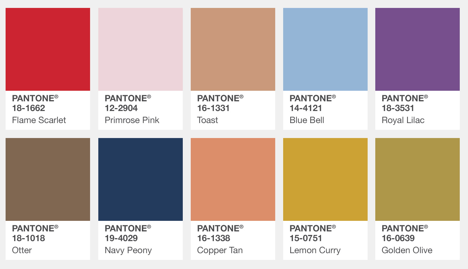
“Led by a vivid Flame Scarlet, the color palette for Fall 2017 in London is comprised of strong classic colors complemented by a few unpredictable shades for the autumn and winter seasons,” noted Eiseman. “Unexpected combinations such as Royal Lilac and Otter Brown or Lemon Curry with Bluebell are eye-arresting and create an unusual color dichotomy.”
Navy Peony is the colour common to both palettes; does this herald a move away from Black to Navy as the go-to autumn/winter neutral?
Time will tell if Navy becomes as popular as Black has been in the past few seasons but some experts’ feel Black is too severe with Navy a softer and more versatile neutral which combines well with warmer shades.
A closer look into the London palette
Flame Scarlet – One of the more vivid and powerful shades from the red family, Flame Scarlet leads the way in for fall in London.
Primrose Pink – New York Palette had Ballet Slipper, London’s version is Primrose Pink. Again from the red family and similar to ballet slipper, this shade glows with health.
Toast – Fitting for autumn, toast is a quintessential shade for fall inviting warmth into the palette.
Bluebell – Adding peace with its soothing qualities, Bluebell is a calm and tranquil shade of blue reflecting connection.
Royal Lilac – Adding a bit of fun into the palette, Royal Lilac is a enchanting and whimsical purple, reminiscent of the theatre.
Otter – Introducing a country colour into the city, Otter adds an earthy grounding to the palette offering a sense of rootedness.
Navy Peony – Every palette needs a dependable and anchoring shade, and so we welcome Navy Peony to the party. This is a solid and stable shade, being the go-to neutral.
Copper Tan – Similar to Autumn Maple in the New York Palette, Copper Tan is a great addition for the fall palette due to the red-brown warmth that it offers.
Lemon Curry – Adding sharpness and heat to the autumn season, Lemon Curry is an exotic and spicy shade.
Golden Olive – A darker shade compared with its New York counterpart Golden Lime, this shade is a mainstay and familiar with the fall palette.


