Have you been in a position of not getting the colour results you want? Do you have often colour arguments with your clients?
As fascinating field as colour is, you will agree that most of the time it is complicated to achieve the right colour. As you might already know, many factors influence the colour. To ensure colour consistency in your production line, you need firstly to communicate colour with accuracy.
Design teams have a challenge in choosing and communicating colours in their designs. Unfortunately colour is presented differently from device to device and even between monitors of the same brand. The client’s view of the colour may be significantly different than what the designer sees on screen.

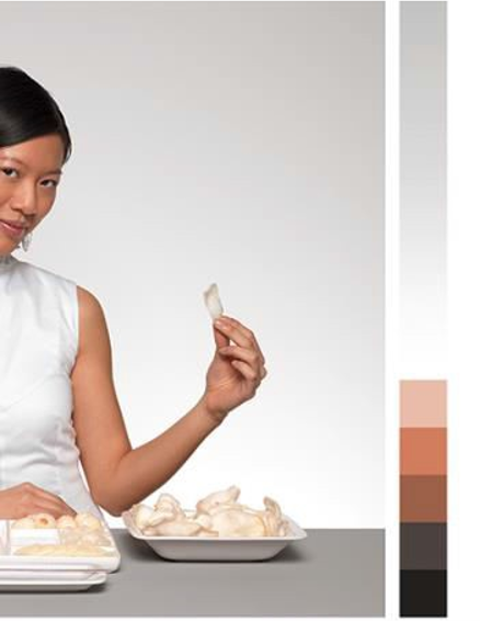
Photo: Image before calibration and Image after the calibration process (source: Pantone, 2018)
This problem causes misunderstanding and miscommunications among designers, technical teams, and the clients, as the colour cannot be defined correctly in the first place. Adjusting the given colour values is not a solution because it can create much more confusion to your client.
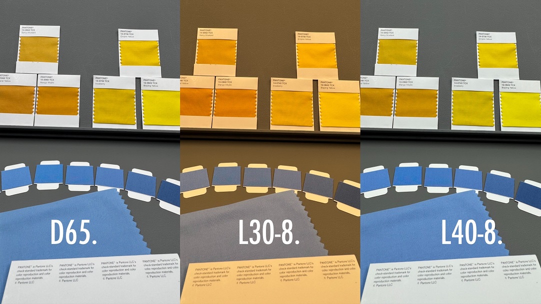
Another challenge is that colour is rarely reproduced exactly on the final materials (paper, textile, or Plastic) as it is shown on the monitor. Additionally, the same colour rarely looks the same in different textures.
One step closer to colour consistency in your process can be achieved with the calibration of your monitor or devices. Designers and manufacturers can save time with using a screen calibration process and resolve frustrations with their customers – provided the customer also views on a calibrated device so that everyone sees the same colour.
Screen calibration adjusts the display settings to show colour accurately. Regular calibration of your monitor ensures consistency of viewing every time.
Why do you need calibration?
Calibration is the process of adjusting the colour measuring instrument or screen to ensure consistency and accuracy every time the same colour is measured or viewed. You need to be sure that everyone collaborating in a project sees what you are seeing.
Without calibration we cannot be certain about how a colour will be reproduced due to the huge range of different devices on the market: all with different levels of sophistication and settings.
Just as your TV screen can be adjusted in terms of brightness and saturation so can monitors, laptops, tablets and phone screens. People adjust them to their personal circumstances such as the brightness of the ambient lighting, their eyesight or the size of any text. All these will change the appearance of colour even further away from the original.
Calibration will ensure consistency with colour from device to device, from your camera, phone, tablet, laptop and monitor to scanner and printer.
Calibration should be an essential part of the colour measurement process too and it is recommended at least once per day. Investing in a calibration tool is crucial, as it offers objective colour results which are not based on an individual’s perception of colour.
Calibration for designers
The screen calibration process is important at the colour specification stage where the colour targets are determined. Designers should ensure that the defined colour in the design file originates from a calibrated monitor and correct colour standard data to enable it to remain the same and consistent during the entire process.
There are many options of calibrating your monitor with online tools or even with Windows and macOS providing tools for manual calibration, adjusting the colour gamut, brightness, and contrast.
However, if colour is an important asset for your business then you should look for greater colour precision and control and invest money to a professional calibration tool for design success.
Pantone’s calibration tool i1 Display Pro will help you calibrate multiple devices (monitors, laptops, phones & printers) with accuracy, allowing you to export the colour palettes directly to your design tools.
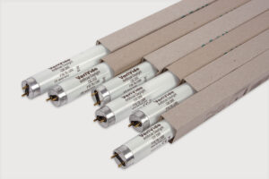
You need to warm up your monitor by opening it at least 30 minutes before the calibration process.
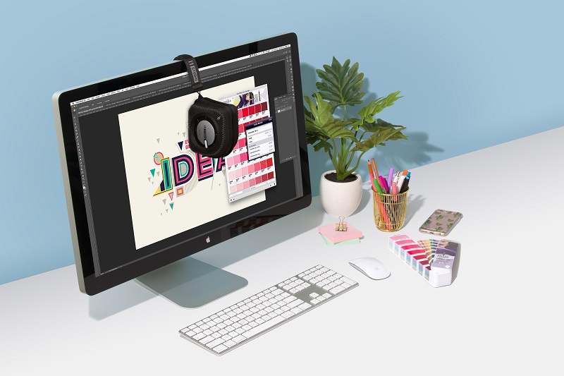
Image: Monitor Calibration with Pantone i1Design Studio
Note: Your colour inspiration can be accurately captured and transferred to your design software by using a Pantone Color match Card when photographing your colour target. Pantone Connect provides the colour values for the Pantone libraries to your Adobe programmes.
Calibration for manufacturers
The accuracy of your colour measurement device is dependent on the right calibration process. Even the most precise colour measurement device, such as VeriVide’s DigiEye system or any spectrophotometer, needs regular calibration to provide accurate colour results each time.
At the pre-production and production stage, colour technologists, quality assurance managers or production managers should calibrate the colour measurement device ideally every 8 hours or in every shift.
Regular calibration leads to the optimal performance of the device. With the calibration process, manufacturers and suppliers are ensuring that the colour submissions will be measured with a high level of accuracy, providing the right colour data which ultimately affects the production workflow.
If the colour is also going to be visually checked and compared against the original design or colour standard on-screen then the monitors/screens must be calibrated. VeriVide recommend certain Eizo monitors for use with DigiEye systems which have a built-in calibrator. This performs a regular calibration every 6 hours, eliminating the need for separate screen calibrators.
For the DigiEye system, we recommend a 10-20 minutes warm-up before the calibration process.
Calibration of the camera and monitor screen of your DigiEye ensures colour is viewed accurately. All parties in the supply chain specify and approve the actual colour of the product in the correct material and textile. Learn how to care for your Calibration Chart, ensuring colour accuracy and consistency.
Feel free to contact us by email to enquiries@verivide.com or phone to +44 (0) 116 284 7790. We are happy to help you with any colour challenges or answer your questions about VeriVide products.