


Have you updated your Pantone Colours recently? Have you renewed your Formula Guides and Solid Chips books within the past year?
If the answer is yes to both questions, then congratulations! You are a very proactive designer that desires to shape the future trends!
If the answer is no, then it’s better to read this blog…
Why is it important not to miss the new Pantone Colours?
Many of our customers keep out of date Pantone products in their office or factory for more than 1.5 or 2 years. This can affect not only the relationship with their clients – leading to embarrassment when they do not have the colour requested. It can also diminish their creativity.
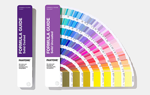
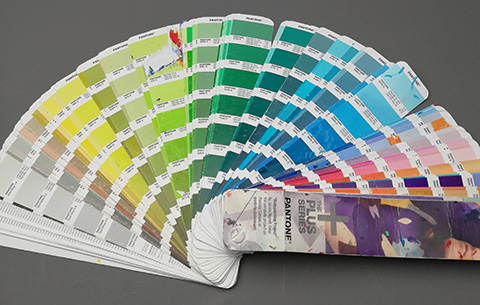
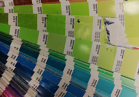
For many years, Pantone products have been the prerequisite tools for Branding and Creative Agencies, Graphic designers and Printers. Pantone guides and books are used for creative inspiration, tools for customer choice and as colour standards for both printed and multiple materials.
Another factor that Pantone colours are so popular is that are used all over the world. Consequently this makes colour communication easier even if designers and manufacturers are on a different continent.
As the competition is fierce and the market always demands new trend colours, it is beneficial for designers to regularly upgrade their Pantone colours guides and books. Utilizing them as a source of inspiration for introducing new design ideas.
Challenges to colour communication
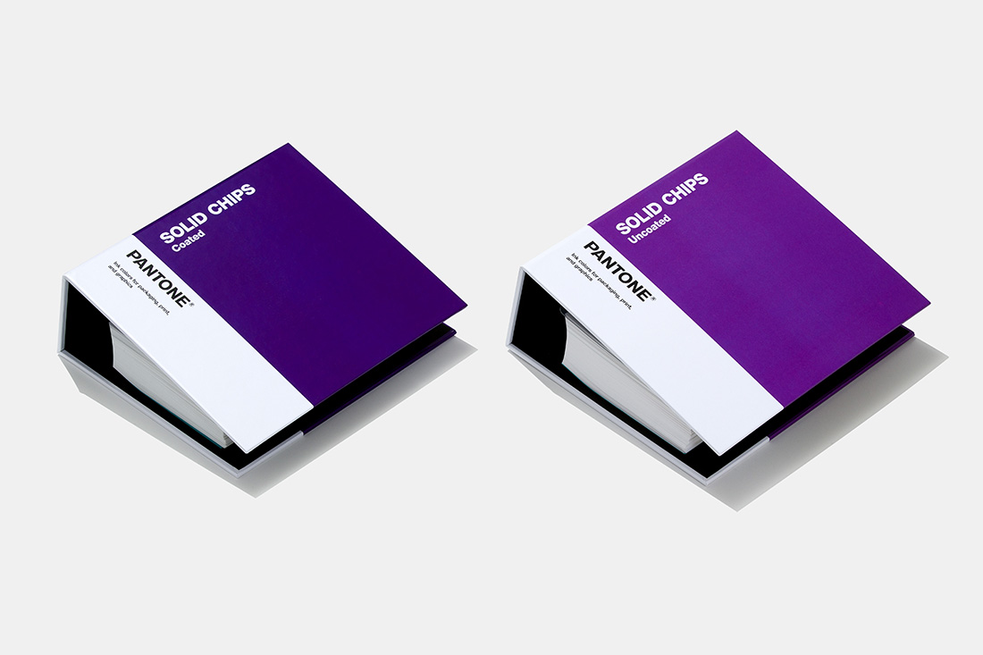
Neglecting to update your Pantone Guides and books for over 2 years, means not only that you will be missing the newest colours but also they are not accurately reliable as they have worn out.
We know that you love your Pantone books and you treat them properly. However, there are other factors that affect the appearance and the performance of the Pantone guides and books, such as:
- The daily use
Using the guides and books every day makes it unavoidable that colour and pigment of the paper will be discoloured and wear off because of the natural oils of your hands even if they are washed properly.
- Atmospheric contaminants
The atmospheric dust and grit can affect the pages when rubbing together, removing the pigments or making scratches in the surface.
- Light exposure
The colours will naturally fade if they are exposed constantly in light. If you leave your guide on your desk or in the production area the fading will be accelerated. Keeping them stored in the dark will help but fading will still occur over time with the lighter colours being most susceptible.
- Paper ageing
The older the paper, the higher the possibility that yellowness will start to appear. When the paper is yellowing it affects the colour matching procedure, as the printed colour squares are affected by the underlying paper colour.
The humidity of the storage room is another important factor as moisture accelerates the age of the paper.
So, why is it important to renew your colour standards sooner than 2 years?
- Better communications and fewer misunderstandings with your clients
If your client wonders “why this colour can’t be matched”, maybe it’s time to upgrade your Pantone books.
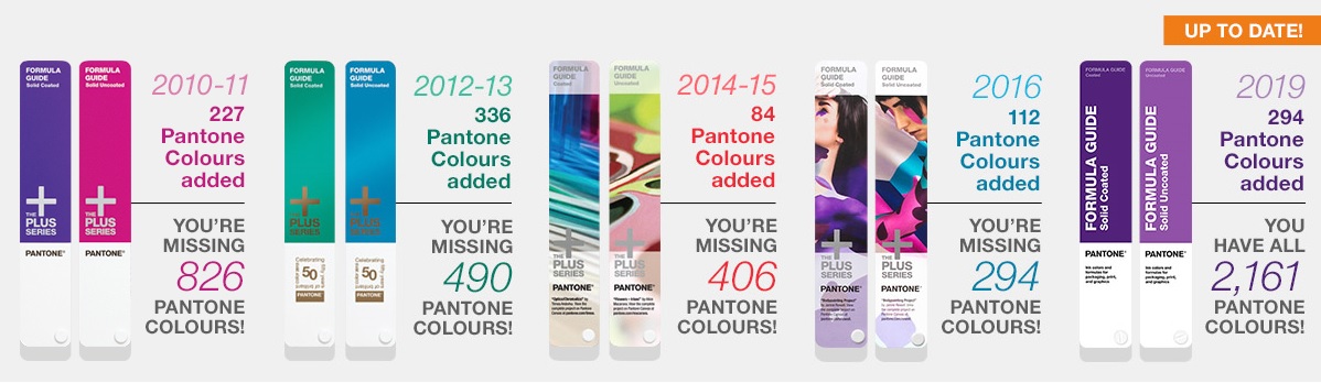
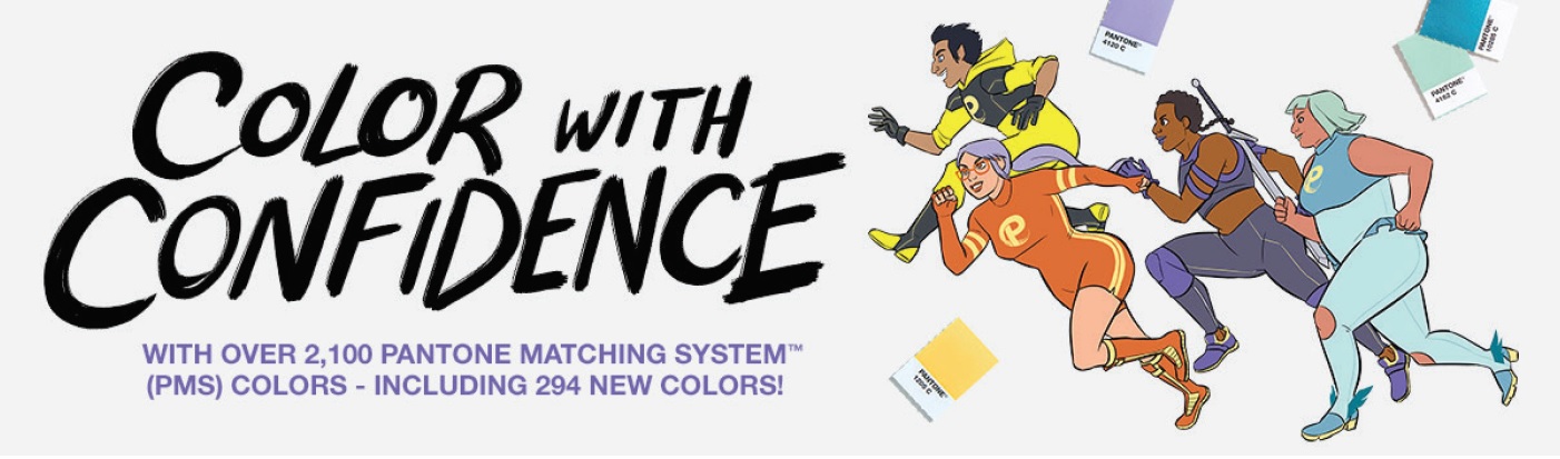
Pantone add new colours to the PMS range regularly.The latest additions of 294 colours have been chosen because they reflect current trends and also to fill the gaps in colour areas. This also achieves more effective, direct matches between Pantone’s Graphics and the Fashion, Home + Interiors Systems.
The top 1000 of the Pantone TCX colours from the Pantone Fashion, Home + Interiors System are now available in the PMS Formula Guides and Solid Chips books. They have different numbers to fit with the Pantone PMS numbering system but can be found by cross reference with Connect software. Furthermore better-cross-referencing colour alignment across the different products means that packaging, POS material, advertising and brand logo colours can now be coordinated to the products.
Improve colour communication
Our colour courses have revealed that often designers and brand owners are specifying a relatively recent colour and then their suppliers request that they change the colour choice. This is only because they cannot find it in their set of Pantone books!
Brand owners, designers and buyers should not be limited by suppliers not updating the Pantone colour guides. When auditing suppliers it is important to include the type and version of Pantone books as part of the colour assessment stage of your audits.
- Save time by making the colour matching process easier and quicker.
Pantone acknowledges that variations in the printing process for the guides in the past have created confusion. A continuous improvement project over the last 2 years by Pantone led to investment in the ink kitchens and printing equipment. Subsequently this ensures the new guides are the best print quality to date. Using the spot ink formulas will speed mixing time to achieve the colours accurately first time.
- Save money by reducing the amount of shipping costs
Colour matching procedures can be time-consuming and very costly, requiring many trial-and-errors in the production samples between the manufacture and the designer. The new guides are better matches to the digital colour standard data. The increased colour accuracy of the ink formulas ensures less trial and error and submissions to clients.
- Last but not least (I think the most important for you)
Enhancing your creativity with new colours and trends is the most important part of your job. You can’t deny that inspiration comes with different resources. So providing yourself with new colour trends will boost your creativity and ultimately your design ideas…
Succeed in colour communication and boost your creativity!
Discover now the 294 new Pantone colours added in September 2019 and keep ahead of the competition. The new colours are high-demand neutrals and colour nuances (blacks, greys, beiges and tans, blues, and olives).