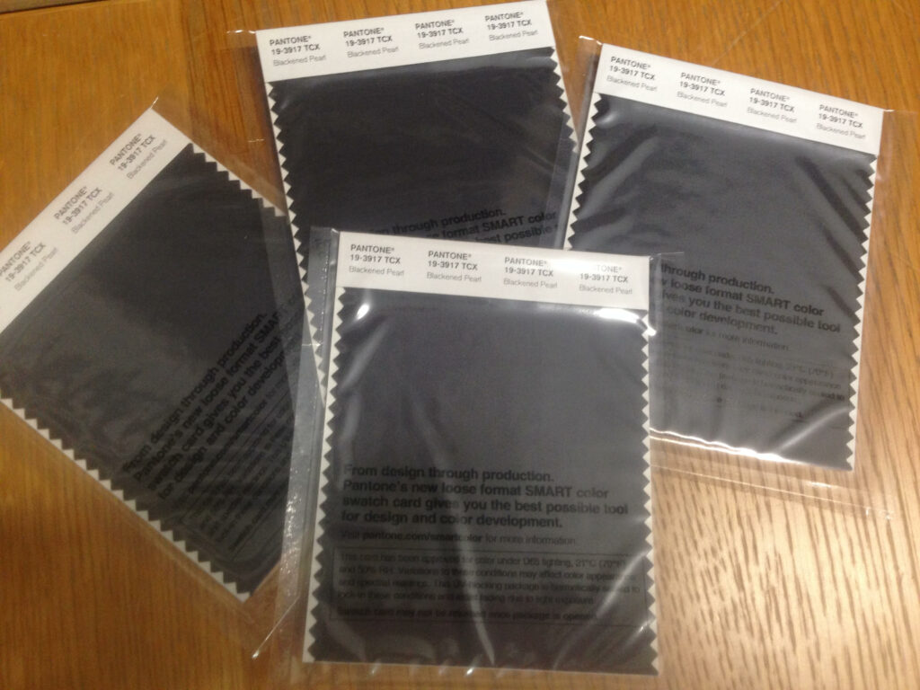


Introducing one of the new grey shades included in the 210 new colour additions to the Pantone Fashion, Home and Interiors colour palette – Blackened Pearl 19-3917 TCX.
What’s the big hype with Blackened Pearl?
Pantone has described this shade of grey to be, “Chic and elegant, strong and solid, the deep and dark Blackened Pearl is a versatile shade that make a statement on its own or act as the foundation to any palette.”
The different grey shades in the new colour additions definitely have a lot to give as whilst grey is a classic, composed and enduring shade; it is also full of mystery and allure. The grey colour family are thought of as being glamorous yet practical at the same time.
What does Leatrice Eiseman have to say?
Leatrice Eiseman states in ‘Colors for Your Every Mood’, “The grays represent solid strength and longevity, an association stemming from the colour of granite and gravel, stone, slate and rock; of ancient monuments, pillars and temples that have withstood the ravages of time and technology.” The colour range most closely linked to timelessness and dependability, there is an implied quality to gray.”
How can you use Blackened Pearl?
Grey doesn’t try to steal the limelight, it is happy to sit in the background and help bring other colours to life. Many designers love to use grey to compliment other colours, as they consider it to be nature’s most perfect neutral. It can help mature pastels, bring calm to bright and vivid shades and is a classic to pair with black and white.
The colour of intellect…
Many see grey as being the colour of intellect. When it comes to the brain and mind we refer to the term grey matter, meaning this shade is often used to represent truth, knowledge and wisdom.
Whilst grey isn’t thought as being an on trend colour, it manages to remain in the spotlight. Grey truly signifies subtle sophistication; it is serious, thoughtful, chic and elegant. Grey also offers the support we need today to help carry us into the future. Whilst it harkens back through time it is also symbolic of modernity and technology, giving us the rock solid stability.
Why more Grey?
Pantone is responding to what the consumers want…
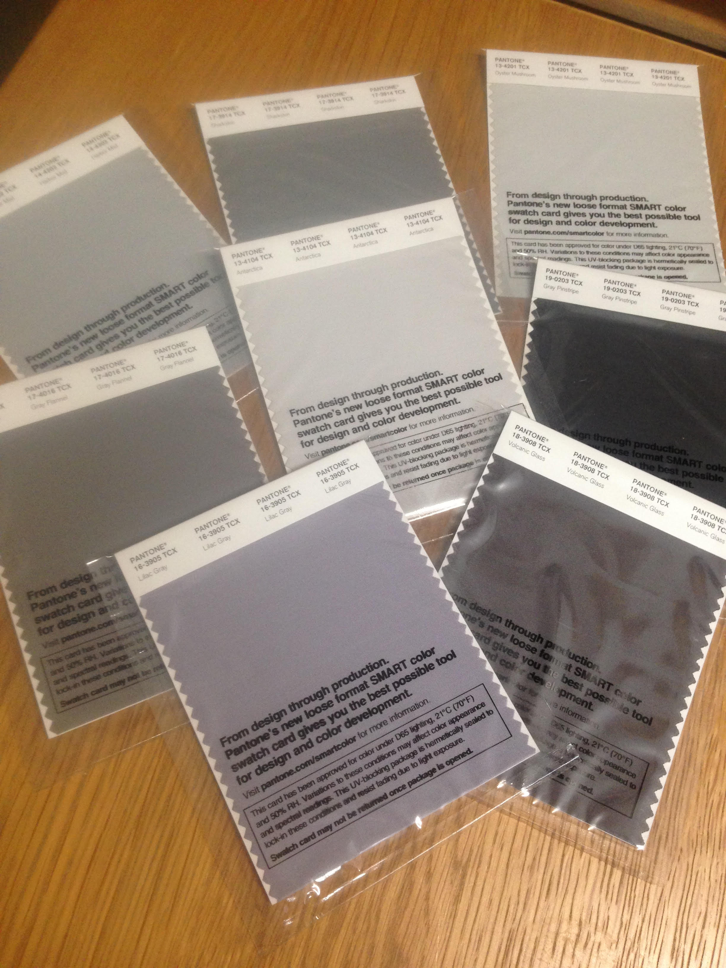
Pantone recently picked up on the increase in demand for greys, therefore, they have added a wider range of greys. The 210 new colours includes varying shades of grey. The Pantone Fashion, Home & Interiors palette contains shades from the subtle Harbor Mist 14-4202 TCX, Antarctica 13-4104 TCX and Oyster Mushroom 13-4201 TCX, to the much deeper undertones of Blackened Pearl and Gray Pinstripe 19-0203 TCX. Mid greys are represented with greener tones including Sharkskin 17-3914 TCX, Gray Flannel 17-4016 TCX and Granite Gray 18-0203 TCX . As well as redder tones such as Lilac Gray 16-3905 TCX and Volcanic Glass 18-3908 TCX.
By introducing the new greys, Pantone are giving designers the wider range of grey shades currently demanded by consumers. Why not explore them further?