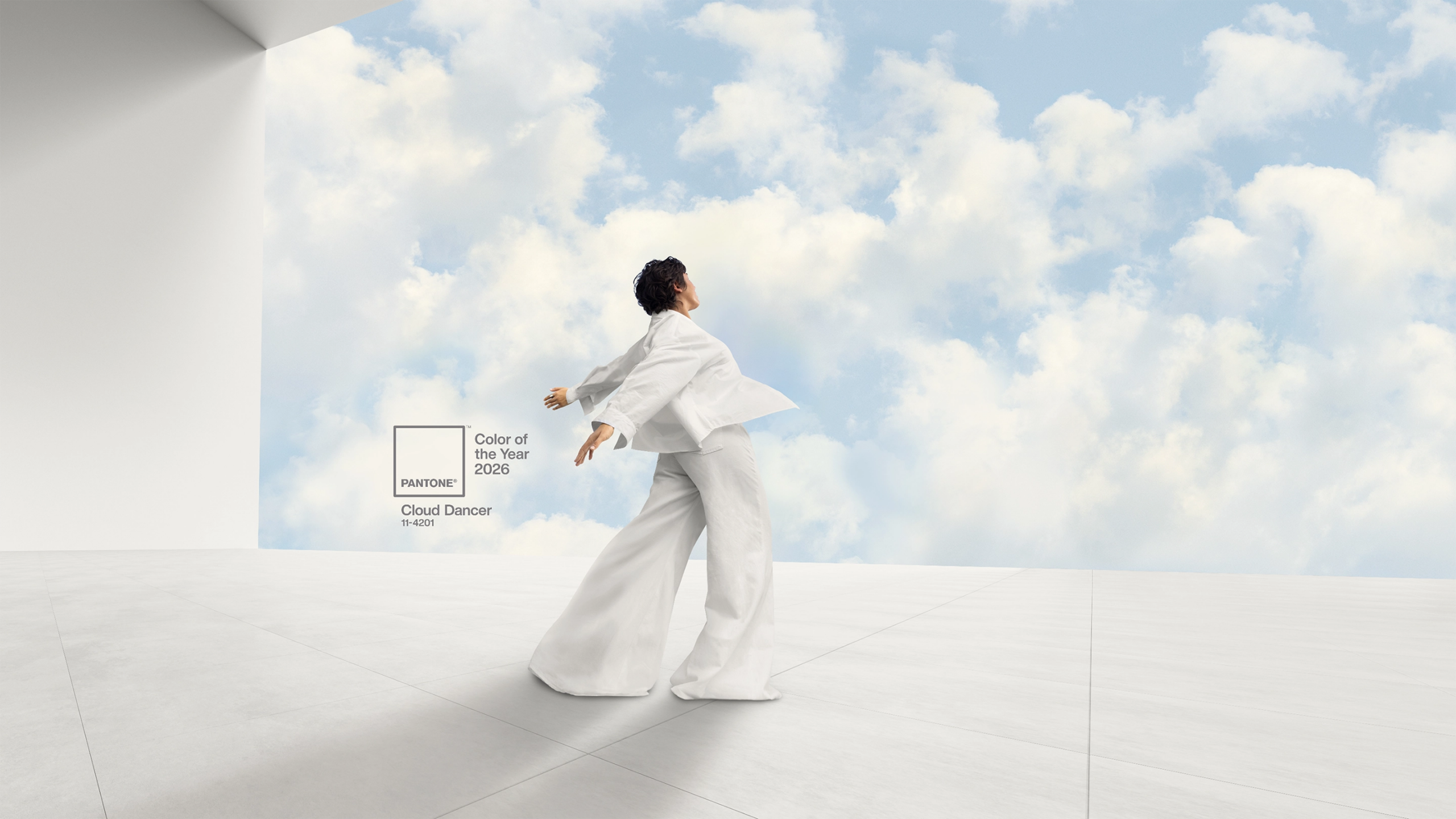
The Pantone Plus PMS Graphics colours have always been known simply by a three or four digit number followed by a suffix to denote if they are printed onto shiny coated paper (C) or matte uncoated paper (U).
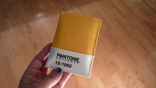
However the Fashion, Home & Interiors range of colours which are produced by dyeing fabric (although a coated paper version of the colours also exists) is different. This range has a numbering system of two digits, a dash and four digits followed by a suffix denoting the material used (TCX for Cotton, TSX for Polyester, TN for Nylon and TPG for paper) but the colours are also known by their descriptive name.
The 2800 colours in the Fashion, Home & Interiors range are chosen from LCH colour space and the numbering system used reflects this e.g. 17-1664, the first pair of digits refers to the lightness scale which in Pantone’s case runs from 11 (white) to 19 (black), the second pair of numbers specifies the hue, and the third pair of numbers describes the chroma level.
The hue circle is divided into 64 sectors with 01 containing yellow-green through to 64 which contains green-yellow. The 64 sectors cover all of the pure colours with 00 being the neutral point. The Chroma level is divided into 65 steps staring with 00 a neutral and ending with 64 being the maximum chroma of the colour.
Thus the number 17-1664 denotes quite a dark, orange/red which is very saturated (bright), 17-0000 however is a very neutral grey but is the same lightness as the red colours.
Pantone color names are chosen by the Pantone Color Institute which is headed by a team of five people led by Executive Director Leatrice Eiseman. More than 40 global color experts work for the Pantone Color Institute with expertise in diverse industries including Fashion Clothing, Accessories, Footwear, Beauty, Home and Interiors, Consumer Electronics, Industrial Design and Graphic and Digital Design.
The inspiration for the colours came from all around the globe, in different natural environments and cultures as well as street fashion trends.
The origins of the colour names are fascinating and in some cases confusing – they come from common language terms, plants and flowers, animals and minerals and even the whimsical imagination of the designers.
Food is a common theme for the names particularly those in the yellow, orange and red hues. It can make us quite hungry when we are packing the individual SMART swatches and we see names such as Caramel Cream, Popcorn, Decadent Chocolate and Gingerbread! However not all of the food names are unhealthy as there are a significant amount of fruit names including Grape, Blueberry, Banana, Super Lemon, Lime Green and Strawberry Pink and vegetables haven’t been forgotten with Celery, Cherry Tomato, Harvest Pumpkin, Peapod, Endive and Sprout Green
We are also envious of the luxurious opulence conjured in our imaginations with names such as Stretch Limo, Caviar, Emerald, Dark Sapphire, Crown Jewel , Purple Reign and Antique Bronze.
Perhaps we can also imagine bathing in one of the seas named as colours – did you know that Adriatic Blue is lighter and greener than Aegean Blue? Or visiting one of the exotic locations although you may prefer to visit Monaco Blue rather than Alaskan Blue or Andorra (which is a rich brown) rather than Outer Space (inky black).
If you need to invest in Pantone Textile colours, VeriVide are the only UK stockist and can supply individual Smart swatches for £12.00 each plus delivery & VAT. We also stock books with the complete range of colours for design inspiration. For more information email pantone@verivide.com or to place an order follow the link to our online Swatch shop.