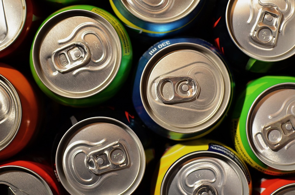


Colour influences our purchase decision, the perception of taste and even our feeling for a brand. We evaluate objects from their appearance and colour is an essential part of this. For example, we make instant buying decisions, recognizing the brand from the colour on the packaging or we perceive the taste or freshness of food by colour.
From packaging and printing to the textiles and coatings industries, colour is a vital element for a brand identity, as it increases brand recognition, trust and customer engagement. For instance, in the aerospace industry companies try to distinguish themselves, creating customised interiors of aircraft with specific colours in seats, walls or desk, aligned with the brand logo image.
Therefore, colour consistency is not only essential for the product’s integrity but also for the brands’ reputation and identification.
Achieving colour accuracy and consistency throughout the supply chain is challenging. So, we decided to share 6 critical steps that will help brands to manage colour better, improving colour accuracy and eliminating colour inconsistencies.
1. Specify the colour
The first step for successful colour management is to identify the desired colour for the product. However, taking a piece of material and try to replicate is not the most effective to specify colour or ensure colour consistency. The problem with the inspiration from general objects is that you do not know the manufacture history and in some cases the material. The true colour spectral data cannot be specified, leading to problems to the next step of the prototyping process. An indefinite standard will yield a bad result.
Colour Reference Libraries or Colour Standards charts like Pantone, RAL or NCS provide reproducible colours for colour inspiration and specification, giving you the colour recipe for more successful reproduction. Having a reproducible standard for colour specification gives you a 90% chance of success.
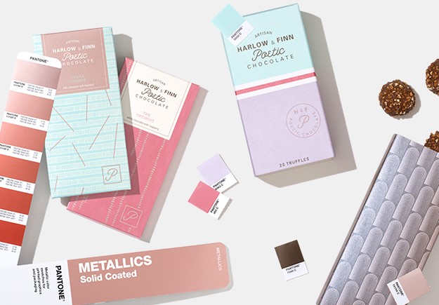
Image: Pantone Metallics Guide (source: Pantone)
Furthermore, colour standards offer solutions for colour communication with international clients. For example, with PantoneLIVE you can share colour data with suppliers and manufacturers across the world, speaking the same colour language.
Defining the colour on a suitable substrate is also important. The same colour can look completely different in another material. For example, taking a colour from glossy paper and trying to replicate it on fabric has many chances to fail.
Considering the complexity of achieving a colour standard where substrates, dyes, inks and the printing or manufacturing process can all influence the final appearance, you must specify colour wisely.
Which Pantone book is the right one for you?
2. Measure the prototype materials
An effective way to eliminate mistakes before the production stage is to test and measure the colour of prototyping materials that will shape the final product. Colour may vary in different kind of substrates.
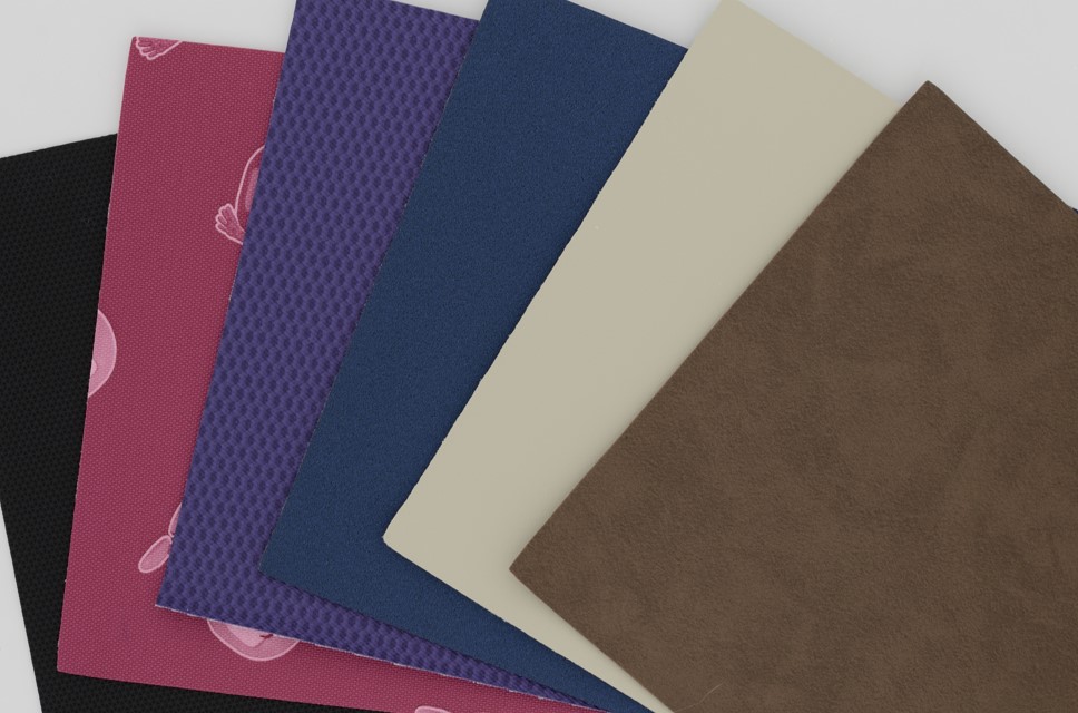
Image: Prototype Materials for Colour Measurement in a DigiEye System (source: VeriVide)
In a plastic bottle, you should test colour of the plastic component and the label separately. You could have several different component material types and constructions to test which all should look consistent. This is especially true for training shoes where the raw materials vary from polyester and rubber to laces and leather. By measuring each component separately, you will prevent mistakes in the final production. It is much more costly to change the colour in the final product than to change it in this stage.
Accurate colour measurement software is needed in this stage, enabling manufacturers to measure colour and check the spectral data for easier colour reproduction. By measuring colour digitally you can ensure better colour consistency and avoid wastage.
3. Calibrate your device
It is important to calibrate your instrument at least once per day, ideally every 8 hours or in every shift. Calibration is necessary to make sure that your measurement device whether it is a spectrophotometer or DigiEye will provide accurate results. By checking the device every day, we test if the instrument works correctly.
4. Communicate colour properly
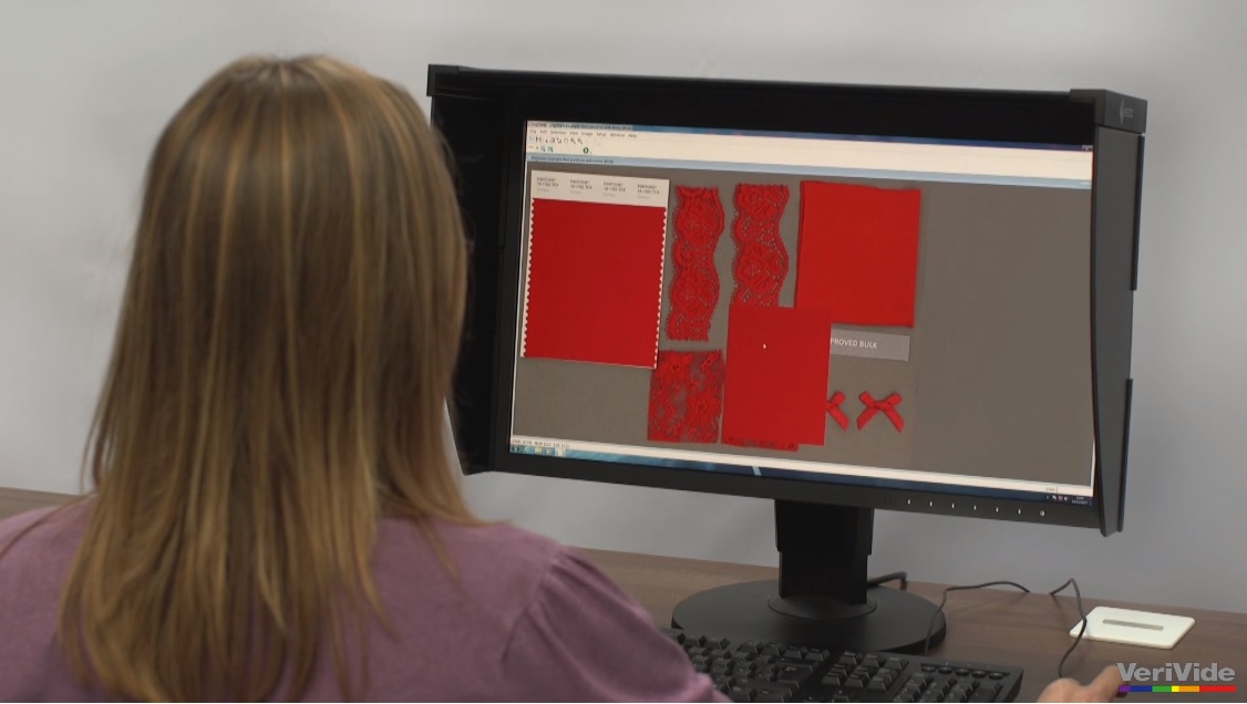
Communicating the spectral data to your suppliers is efficient and easy with colour measurement software. However, that is not enough, especially if you have various suppliers at multiple sites. You must communicate colour as specifically as possible by sharing with your supply chain also colour specification data such as RGB data, CIE l*a*b* values (l: lightness, a: red/green value, b: blue/yellow value) and their associated tolerances.
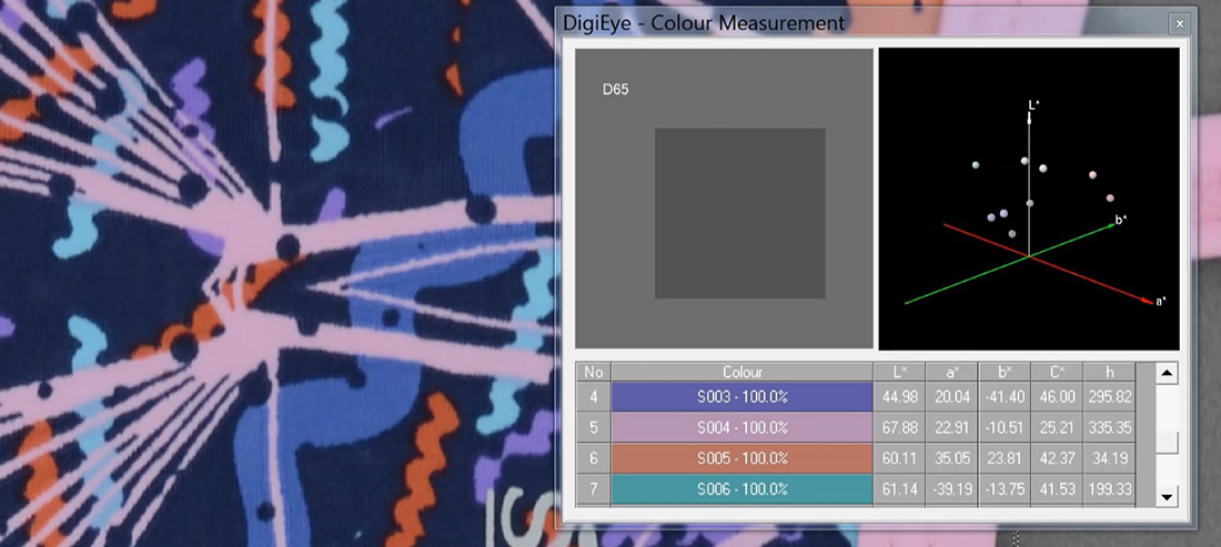
Image: Spectral Data of printing material in DigiEye System (source: VeriVide)
Colour performance data should be also shared such as colour fastness standards for textile colour measurement. Last but not least, don’t forget to share instrument settings such as the size of the aperture or if specular is included. Communicate also the light sources used for measuring. The more specific you become the more accurate the colour of the final product will be.
5. Assess colour under a Light Cabinet
How does your product look in a store? Does the product match with the specified standard?
To answer the above questions, you will need to assess visually the colour and appearance of the final product under standardised viewing conditions. VeriVide’s Light Booths are an indispensable tool in the quality control procedure, as they offer controlled environments compliant with ISO 3664 and BS 950 Part 1 international standards, enabling you to evaluate how the product’s colour is going to look under in-store LED lighting.
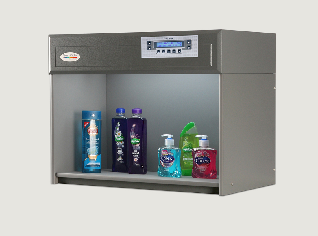
Image: VeriVide’s Colour Assessment Cabinet LED P.O.S.
Also, by evaluating the colour under different light sources (D65 artificial daylight or D50, Tungsten Filament, UV etc) you can easily detect metameric matches. To make sure that there is colour consistency from batch to batch, you should evaluate the new batch or sample alongside the standard and previous batches to make colour comparisons.
Are you LED ready..?
6. Communicate colour again
If the samples do not fulfil the retailers’ expectations, the necessary adjustments should be done. At that stage, the appropriate colour communication to manufacturers and suppliers plays a major role to final product’s success.
If you have adopted a DigiView system for vision-based remote colour assessment, you can communicate colour instantly and give the exact colour data in real-time to your suppliers from anywhere, achieving accurate colour reproduction.
Learn more about Remote Colour Assessment
If you need to refresh your mind with the fundamental of colour management, we provide customised Colour Training Courses with our Chartered Colourist, depending on your needs. For more information email to us at enquiries@verivide.com or call us to +44 (0) 116 284 7790.