


Visual assessment has proven to be an important weapon in the quality assurance arsenal of numerous brands. If you do not visually assess products in a controlled environment, your business is open to oft expensive consequences.
If visual assessment is already part of your quality assurance procedures, there are a number of key steps to follow. The first step is assessing products or samples in the best possible location. Simply viewing at your desk under office lighting does not give an accurate picture of how the product or sample actually looks. A controlled environment with different light sources is necessary.
For brands, incorrect visual assessment can result in reduced sales. This is particularly true for products not viewed under a point of sale light source that replicates in-store lighting. For suppliers, if best practice visual assessment is not performed, products can be wrong and entire batches rejected. Often, this results in an expensive trip back to the drawing board or even fines.
Following the best practice guidelines provided by VeriVide below will help ensure product quality.
1. Use a Light box/ Light booth/ Colour Assessment Cabinet
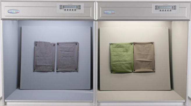
Known by a number of different names, light booths are usually manufactured with a neutral grey interior to provide a standardised background and uniform light reflection around the cabinet. Occasionally, light boxes will come with black interiors for the viewing of highly specular (shiny) materials.
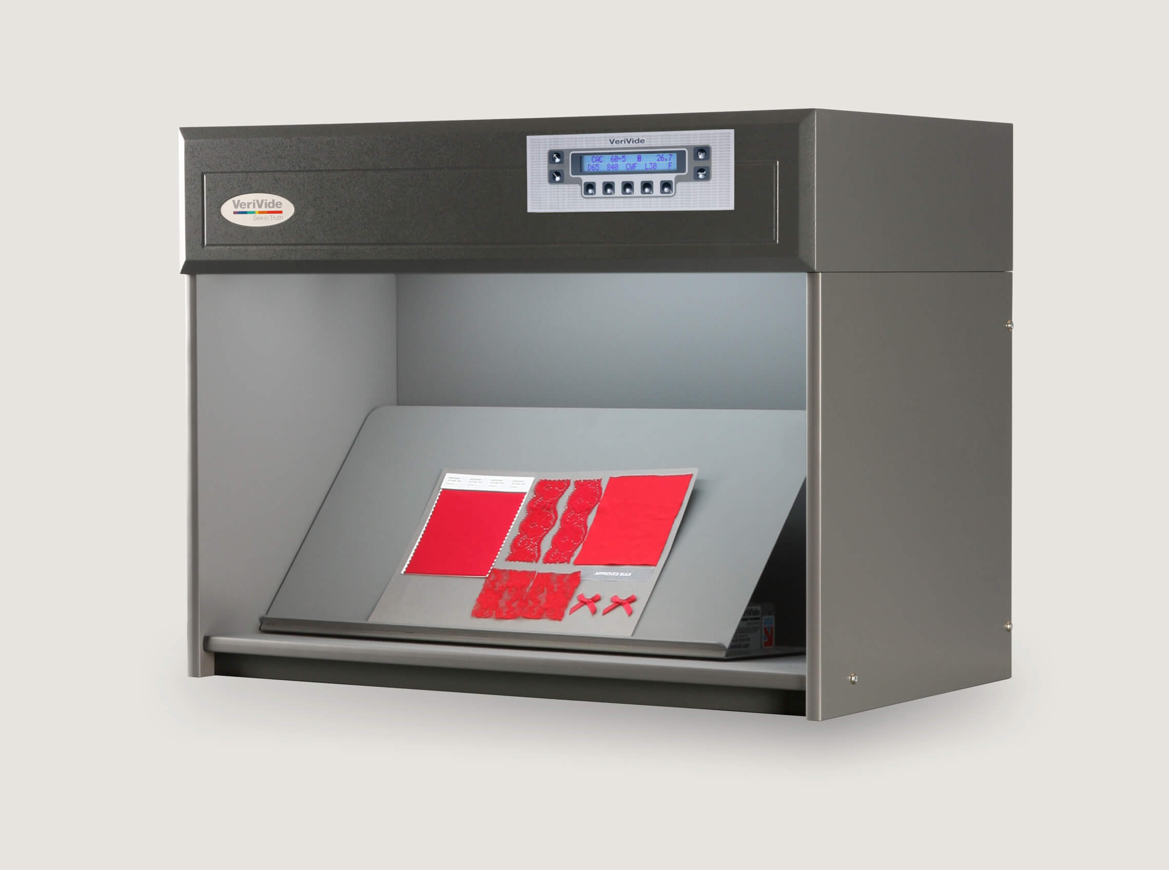
Image: VeriVide CAC-LED 60, Fixed Angle Table, with sample and batch
2. Choose the correct light sources for your cabinet
International standards relating to a number of industries exist for visual assessment. Many retailers and brands in textile, automotive and consumer products industries have their own supplier specifications. If in doubt ask the purchaser, client or end-user for a specification.
If you are the specifier, consider all light sources that a product will be viewed under (e.g. store lighting, home lighting, daylight) and select these for your cabinet. Most manufacturers are able to fit four or five light sources in a cabinet. The new UltraView Light Booth has a minimum of eight light sources.
For more information on how to ensure colour consistency with our light sources click here.
3. View samples under more than one light source
Assessing a pair of samples (typically the colour standard and a production or trial batch) under only one light source is not enough. If the specification is for a batch to match a sample under D65, you still must assess using other light sources. If you ignore other light sources there may be consequences, as they will not be ignored by your customers. If a sample matches under D65, this does not mean that the same will be true under CWF point of sale lighting, which can result in disastrous metameric matches.
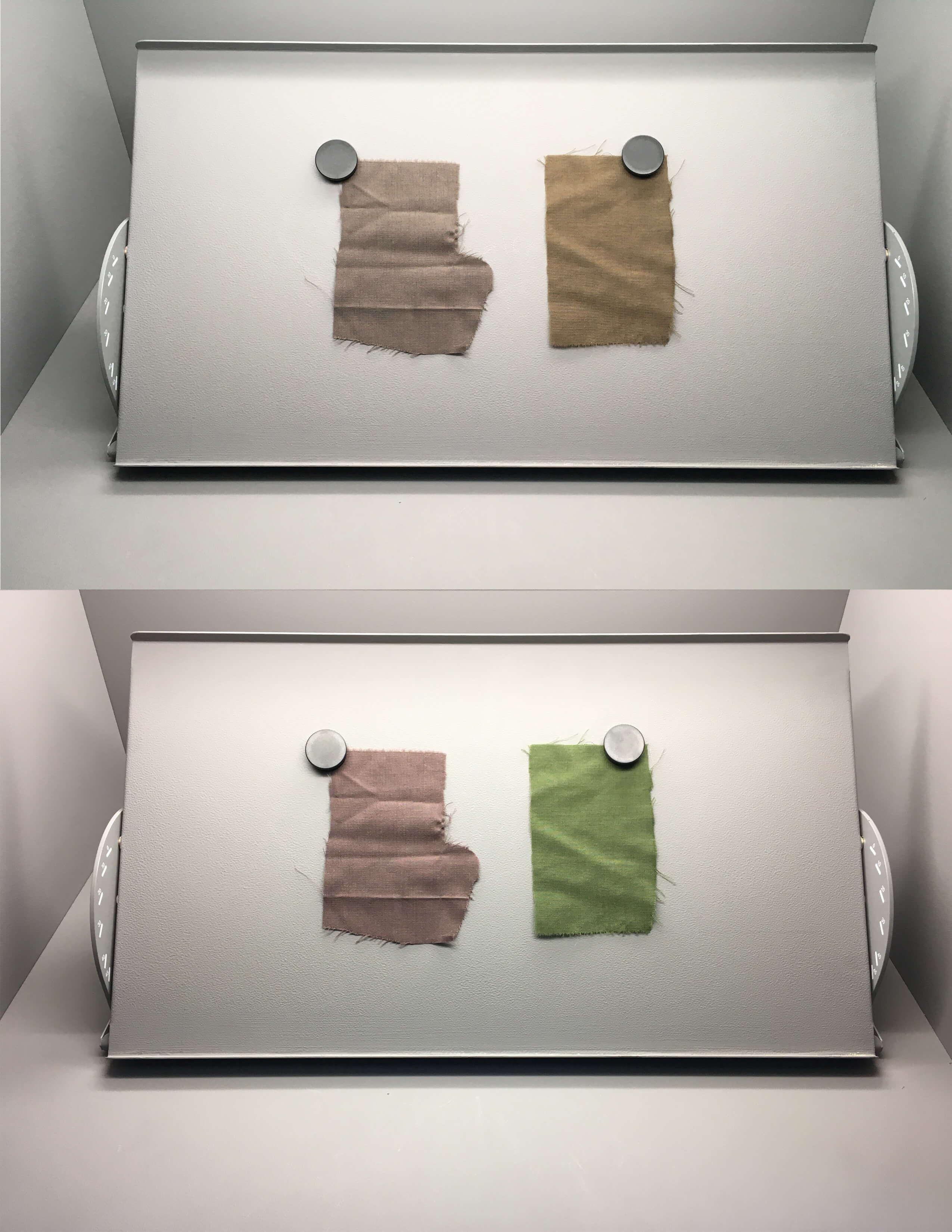
Image: Samples viewed under D65 lighting and 840 P.O.S displaying metamerism
Metamerism commonly occurs when a different dye, ink or pigment formulation has been used than on the original standard. Often when working with different substrates original standard recipes cannot be used. It is important to visually assess all substrates to highlight metamerism early. If you do not check for this your customers will discover the mismatch and this will result in costly complaints.
4. Ensure your Cabinet is correctly maintained
VeriVide recommends that you clean the interior and the lamps regularly with a soft dry cloth. The cabinet interior should be repainted annually to maintain a clean and fault-free interior. Lamps should be replaced annually (or after 2000 hours of use) as performance will suffer (even though they will continue to illuminate for many more hours). VeriVide can supply spare lamps and paint. Alternatively, our expert service engineers are available to install, certificate and service your cabinet. For more details contact us.
5. Site your lighting cabinet away from direct light
The only light inside the cabinet should come from the lamps you have selected. Site away from a window and ensure that any overhead lighting near the cabinet can be switched off while in use. If you can see light spilling into the cabinet when it is switched off it will also be there when it is in use and will interfere with the viewing area.
6. Ensure users have been tested for colour discrimination
8% of males and 0.4% of females suffer from some form of colour blindness. Even when no colour vision defects are present, some people have difficulty in seeing very small differences in colour. The Farnsworth Munsell 100 Hue Test is an effective for identifying the ability to discriminate colours. Purchase the test kit from VeriVide or book us to administer it. To learn more about our Colour Vision Testing, click here.
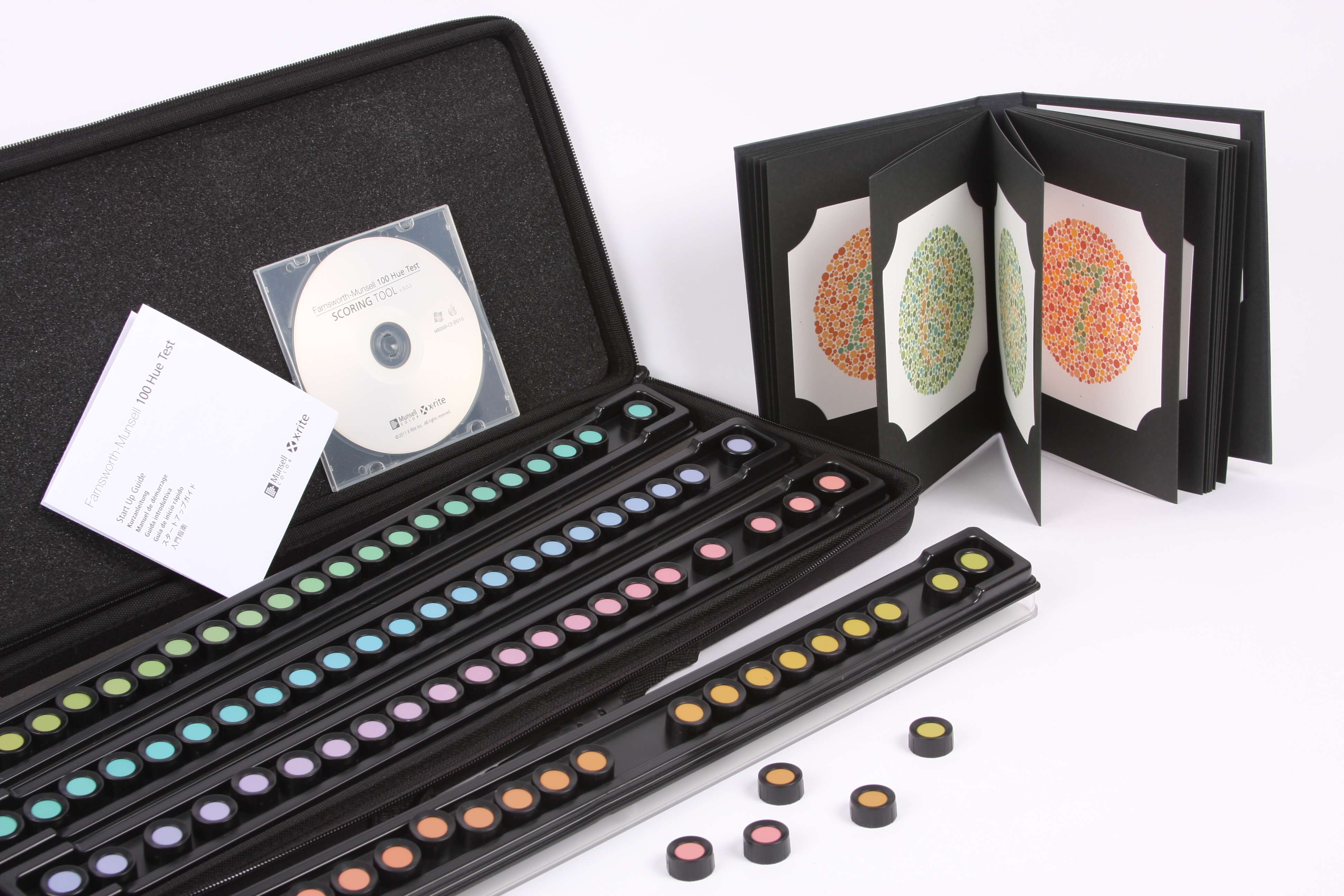
Image: 100 Hue and Ishihara tests
7. Do not wear tinted contact lenses or tinted glasses
Tinted lenses will affect your colour vision. If your vision needs correcting always wear clear lenses when colour matching.
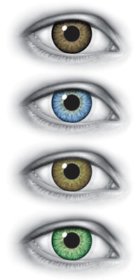
Image: Effect of tinted lenses
8. Arrange your samples correctly
Lay samples side by side, avoid leaving a space between the standard and batch and ensure that they are oriented in the same direction. You can view at a 0/45 degree angle by placing on the bottom of the cabinet. Purchasing a Fixed Angle Table allows you to view at a 45/0 degree angle as specified in some colour matching standards.

Image: Samples being viewed at different orientations
9. Work from the neutral colours to the more saturated colours
If you have a range of colours to assess, do not switch from assessing one saturated colour to another. Always try to build up to a saturated colour by viewing less saturated samples first. It is also best practice not to agonise over a decision for too long. This is because your eyes become less sensitive if you stare at the same object for more than 10 seconds at a time. If you are struggling to make a decision, repeat the process after resting your eyes.
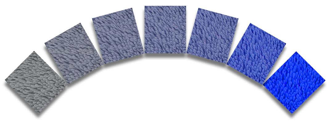
Image: Range of samples with different levels of colour saturation
10. Rest your eyes
Remember to take regular breaks. This advice is particularly important for the assessment of saturated colours.
There is always more space for knowledge. if you want to refresh your knowledge about how we perceive and communicate colour, book a Colour Training Course for you and your team. For any colour advice please don’t hesitate to contact us by phone on +44 (0) 116 284 7790, email at sales@verivide.com or fill the form.